
Over the past month, I’ve been conducting interviews with many of our agency partners, clients, and colleagues to gather their feedback and deepen our understanding of the industry we serve. The things I’ve been hearing are both affirming and challenging, and I’m excited to begin to apply their insights to a variety of things—from how we work to the kinds of content we create. While I’m naturally cautious and unlikely to rush into things, I don’t want to waste any time in acting upon feedback if there’s something I can do differently right now. In fact, I’m starting with this article, which I’ve written in direct response to some particularly wonderful feedback I received from our friends at Callahan Creek in one of these interviews just a couple of weeks ago.
The gist of it was this: There is still come confusion about how designers should interpret prototypes, resulting in many unanswered questions up front. What, exactly, is the role of design in prototyping? Once a prototype is approved, which aspects of it should designers take literally and which are more flexible? As I listened to these questions, I realized that, despite having plenty of content about why we prototype and how the process works, we needed to answer them with material directly addressing the relationship between prototyping and design.
So, without further delay, here it is. Just a heads-up: this article is quite long and includes many visual examples that I hope will clarify the prototyping and design relationship. It doesn’t need to be read in one sitting, but if you do want to tackle it all at once, you might want to top off your coffee and find a comfortable spot.
What You’ll Learn
- What a prototype is,
- how prototypes communicate technical things without being overly technical,
- how pages are structured in prototypes, and…
- …how designers should interpret them,
- and many other details that tend to be confusing to designers.
Ok, let’s dig in…
What is a Prototype?
In the past, I often would describe a website prototype as a plan for how a website works, not how it looks. While, in a sense, I still think that’s true, I’ve come to realize that it’s actually pretty confusing, don’t you think? Especially since we go on and on about how sitemaps and wireframes are inadequate website planning techniques because they can’t be experienced interactively, like a website. But a very big part of the web experience is visual! Every aspect of a website’s structure and functionality is represented in some visual way by its prototype. With that in mind, it’s much easier to see how the distinction between prototyping and design is fuzzier than I’d thought.
So, to better describe what exactly a website prototype is, I’d like to start by drawing a pretty simple analogy: Just as architectural plans use a consistent visual language to describe buildings, prototypes use a consistent visual language to describe websites. In both cases, there are many good reasons for the consistency part. Architects are trained to read plans and discern critical specifications from them that are later translated into three-dimensional structures. Likewise, website developers are trained to interpret prototypes and translate their specifications into functional code. You could say that the use of conventions make the plans look very similar, but that doesn’t stop the results from being quite distinct.
Here’s an example (FYI, it’s going to involve a bit of scrolling):
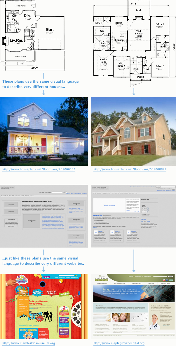
See what I mean?
For designers, rather than seeing the prototype as a document that imposes limitations, I think it makes more sense to see it as one that enables creative freedom. Believe me, I’m not trying to spin this. To milk my architecture analogy just a bit more, imagine if blueprints didn’t exist. Without them, it would be amazing if buildings were built at all, but it would be even more incredible if the ones that did remained standing! In the same way, prototypes provide a structure that ensures a website is even possible. No matter how great a design might be, if it’s not possible, it’s useless.
Essentially, what I’m saying is that a good prototype wants to support good design, not step on its toes. But I realize I’m going to have to get a bit more into the details of how prototypes communicate in order to build my case, so bear with me…
The Language of Prototypes
The first priority of a prototype is to accurately represent the information a website will contain. That includes structural information—like the hierarchy of pages and sub-pages that make up a website—as well as content, which includes everything from the words and images displayed on pages to the logic behind content relationships and other functionality. In other words, a prototype has a big, big job: communicating a ton of technical information that will be understandable to everyone involved in the project—the technical and the non-technical—without using technical language (or for that matter, even working at all). Let me explain…
At the time of this writing, sunrise is expected about 15 hours from now. Maybe if I’m still up then (working on this article, of course), I’ll stop for a break and watch the sun come up. Buuuut, probably not. The reason I bring up sunrise is that it’s a perfect example of phenomenological language, which is exactly the kind of language a prototype uses. If you speak prototype—which I hope you will by the end of this article—you speak phenomenologically, which is to say, you speak in a way that describes experiences. We know that the sun doesn’t actually rise, but from our subjective vantage point way down here on Earth, it looks like it does. The Earth would have to be much, much smaller in order for us to experience its day-long spin. So, despite our modern enlightenment, we still say “sunrise” because it’s a whole lot clearer (and less pedantic) than saying “the time in the morning when we’ve spun around enough to see the Sun again.”
Prototypes describe what it will be like to use a website—that’s the phenomenological part—in a way that satisfactorily engages and prepares the client, without confusing anyone with overly technical jargon. But that leaves one question: if the prototype doesn’t use technical language, how does a developer know what to build?
To answer that, let me first show you an example of a prototype:
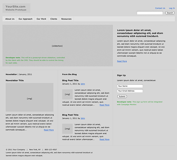
The first thing you probably noticed is that the prototype is mostly gray. We do this intentionally just to make sure that nobody gets sidetracked by any aesthetic hang-ups—at this point, we’re not interested in whether the prototype is pretty, just whether it works. The second thing you may have noticed is that the prototype looks like a website…well, sort of. The page is certainly layed out like a website would be (and, were this an actual prototype, you could navigate from one page to another), but some things are specific while others are generic. For instance, the main navigation has what look like specific page names in it, but other parts of the page have generic titles like “Blog Post Title.”
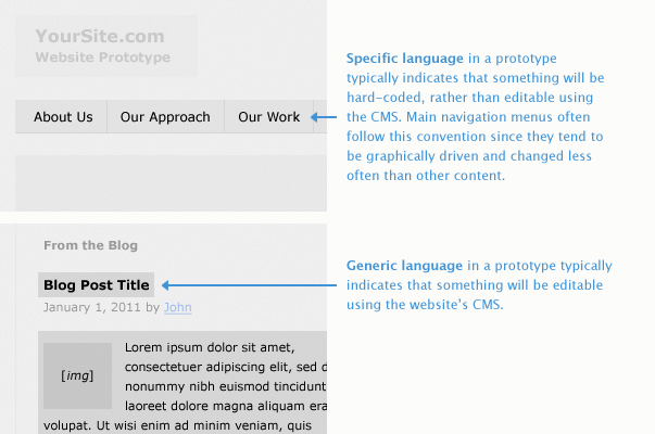
These are the brass tacks of the language of prototypes. In general, some aspects of the site will be very specific, and the way the prototype describes them will reflect that. So, from this image, the main pages (and their sub-pages) are named, and though that doesn’t necessarily mean those names cannot be changed once the website is built, they’re probably not likely to do so very often. On the other hand, the blog post that is featured on the homepage is likely to change very often. By using generic language, as opposed to prototyping a specific blog post title, the prototype is communicating to the developer that the site should be built in such a way that the end user can add new blog posts and name them whatever they wish. Just like “lorem ipsum” dummy text generally means “text will be here,” generic titles stand in for types of content that are meant to be editable.
The Structure of Prototype Pages
Here is where I think most of the fuzziness between prototyping and design comes in to play. Because the prototype must communicate the website experience (that phenomenological language again), it has to work like a website—which means you need to be able to click from page to page. But in order to work like a website, it has to look like one, too. That’s why sitemaps—they don’t look or work like a website—and wireframes—they look (in a Flatland kind of way) like websites but don’t work like them—fail to communicate anything useful about, well, using websites. Where I’m heading with this is that since prototypes need to look like websites, they can’t look just any way. The honest truth is that building a prototype does involve a kind of design.
The kind of design I’m talking about has to do with communicating the priority of information on a page—or, for short, information design. The prototyping process involves returning to two core principles over and over again with every information design decision that the team makes:
- What is the purpose of the website, and
- For whom?
The answers to those questions should lead to very focused pages with a clear sense of priority. This is often manifested in visual decisions, such as the relative sizes and positions of elements on a page or typographical details if the volume of information on a page warrants it.
Let me unpack this with another example:
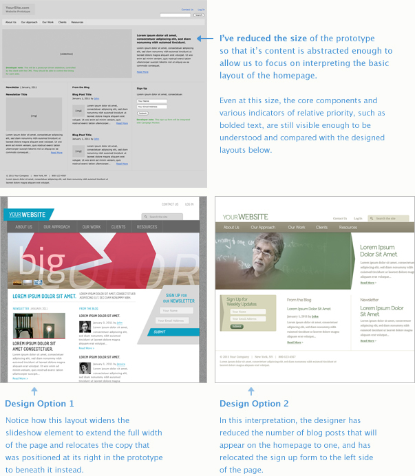
I created these simple mock designs for my example prototype in order to make a simple point: Though the prototyped homepage has a very deliberate layout in which the information on the page has been clearly and intentionally ordered, the spectrum of possibilities for what the final website can look like is still wide open.
Both examples take many liberties with elements of the page, but neither remove essential information nor disrupt the order of the information in a way that fundamentally changes the focus of the page. The interactive slideshow element, which occupies about 3/4 of the horizontal space at the top of the page, is still the most prominent visual element in both designs, even though Option 1 has changed its size. The sign-up form is not fundamentally affected by being relocated, nor has the choice to limit the number of blog posts on Option 2 significantly altered the overall priority of blog content on the page. Aside from these specific layout choices, Option 1 and Option 2 represent very different creative directions even though they share the same prototype.
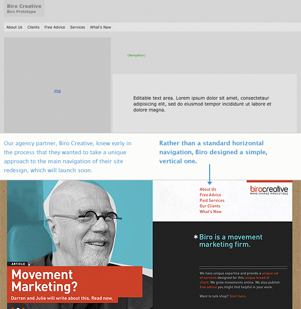
Designing Navigation Menus
Navigation menus are probably the most important user experience tool a website has to offer. Without them, most websites would be completely disabled—leaving vast amounts of content simply unreachable to users. But even if a page contained enough links in the content to make it possible to reach every other page on the website, a clear, structured navigation system also communicates the overall order and intent of the website. Depending upon how they are constructed, a user could potentially get an overview of all the pages and topics a website contains without actually clicking anything. For browsing-oriented users, this is critical to their experience.
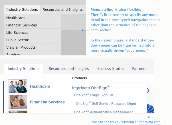
Usability studies have continually affirmed that the conventions you are probably used to—horizontal navigation bars with interactive, vertical sub-menus—are highly effective and usable as they scale in complexity. This is precisely why that style of navigation is the default for our prototypes. But that doesn’t mean that every site must necessarily employ that style of navigation menu. Our own site is in good company with others that have used a simple list structure, for instance, rather than the standard horizontal navigation. In our case, we felt that our site did not have a deep enough structure to merit anything more complex, and have had that decision continually affirmed by analytics data since.
Typically, a prototype will preserve the standard menu approach, but include a note to the developer working on the project describing how the design will alter the final menu interface. As long as the conceptual structure of the website—its top pages and their sub-pages—isn’t fundamentally changed, the interface is certainly negotiable.
Here is an example of a currently active project where the designer planned to implement a navigation interface that was slightly different than the prototype. Below that is an example of how the drop-down menus of a standard navigation bar can be handled differently:
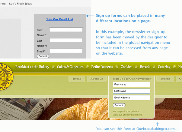
Repositioning Forms
Our approach to forms during the prototyping process is similar to our default approach to navigation menus—to follow established conventions that ensure the most stable user experience possible. Because heat map studies continue to affirm left-to-right zigzagging user patterns on web pages, form widgets are most commonly placed on the upper right-hand portion of web pages. It’s a bit of a chicken-and-egg scenario, actually. Since content-related tools and resources are typically found on the right side of web pages, users intuitively return to that location as they read through pages. So, it makes sense to continue to place utilities in that space. But just because the convention is securely rooted in usability data doesn’t mean there will never be good cause to do something different.
I imagine that as we continue to learn more about how to make forms and other calls to action more user-focused, the convention will surely be tested and perhaps fundamentally changed. Meanwhile, implementing these kinds of touchpoints in the mobile context will also generate a feedback loop that will begin to shape behavior in other contexts, especially back on our desktops. That will be a trend to watch.
Below is just one example of how a designer tried a different approach to positioning a form element. Again, like designs that alter navigation interfaces, no information has been removed or fundamentally changed about how the form works. But it’s position now makes better sense given it’s priority as a global call-to-action.
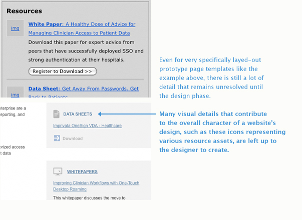
Sub-Page Templates
In the past, a typical web design project would involve the design of a homepage template and maybe one or two sub-page templates that would be used for the majority of the website’s content. Today, the number of uniquely designed templates is growing as our understanding of persona-based user interfaces (and overall sophistication of approach) increases. Specifying unique templates shouldn’t wait for the design process, though. This should happen during the prototyping process as well. In fact, a typical prototype today can include anywhere from 30 to 50 unique pages. That’s quite a lot when you consider that you only have to prototype an example of a blog detail page once!
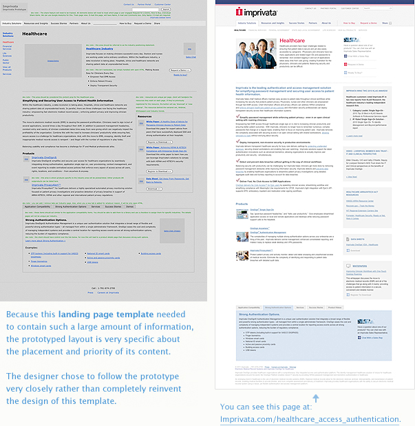
But even unique pages can share the same layout. The point to emphasize here, again, is purpose. What is the page for? What information needs to be on the page in order to make it successful? As you work your way down, so to speak, in a website’s structure, sub-pages should become more and more focused. A third-level page in a website’s overall hierarchy—naturally more of an endpoint in a user’s flow than something higher up—should provide fewer, more specific options. That means that top-level landing pages—those that provide overviews of product families, service offerings, and the like—will tend to be much broader topically, and consequently, a greater information design challenge. Those pages, just like the homepage, should be prototyped as specifically as possible in order to ensure that the information design problems are being solved before the visual design process starts.
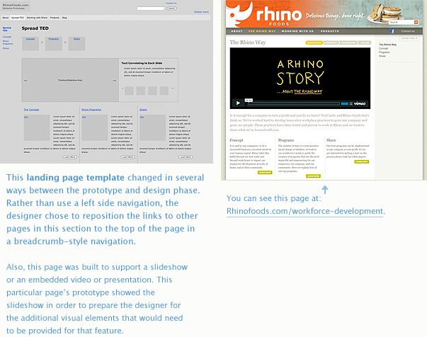
Below are several examples that will shed some light on various approaches to high-level landing pages from prototyping to design. In the first case, the design of the page takes a more literal approach to interpreting the prototype, which was done with a higher degree of precision given the capacity issues it faced. In the second example, the designer was afforded far more latitude given its lighter load of content and some particulars related to how interactive features are working on that page.
The Devil is in the Details
Aside from the confusion around how a page’s structure should be interpreted and handled by designers, there are a couple of minor details I wanted to point out that are often easily overlooked in that fuzzy place between prototyping and design.
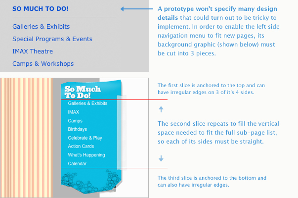
The first has to do with how different areas of a website will expand to fit changing content. Remember, if your website is using a CMS (I really hope it is), content on just about every page of your site is likely to change. But as powerful as a CMS is, it can’t change graphical elements on the fly. Imagine a sidebar that you’ve designed to have an uneven edge. In your composition file, it looks great, but as soon as the content is actually changing and growing, you’re likely to have a problem. How will that area stretch to fit? For dynamic content areas like this, the best approach is to keep jagged areas limited to the fixed portions—often the top and bottom—and design the flexible ones to have backround images that can repeat as the vertical space expands. I’ve included an example of this below.
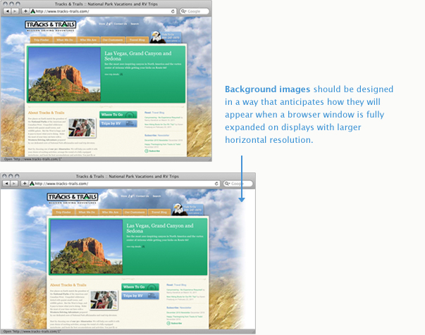
The second also has to do with background graphics, but this time those that fill the browser window behind your website’s main content area. Using unique images here, as opposed to solid colors, can be a great way to add space and mood to your design, but you want to make sure that your images are wide enough to fill even the largest possible horizontal resolution, or have an edge treatment that enables them to gracefully fade to a solid color or texture. Even if you have created background imagery that does anticipate wider screen resolutions, try to make the transitions as subtle as possible. I’ve included an example of this concept below, as well.
Parting Notes
You’ve made it to the end—congratulations! Even though this page is jam-packed with information (and must be one of our longest pages so far), I feel as if I’ve barely scratched the surface. While most of the things that tend to cause confusion for our design partners are covered here, there are so many details and variables that are relevant to the prototyping/design relationship that aren’t.
So, let’s use the comments section of this page to handle any questions you may have about the things I may not have covered—or the things I did. I’ll respond to each one. And if you’d rather ask a question in private, you can contact me directly here.