
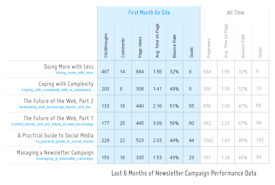
You may have an easier time following along with my post if you look at a larger version of this chart. Click here to open this chart in another window at it’s actual size.
Over the past several months, I’ve tried to keep a closer eye on how our newsletter campaigns are performing to see if I can draw any conclusions as to what makes one more successful than another. What I’ve decided is that it all depends upon what you mean by successful…
If It’s All About Clickthroughs…
If I evaluate success in terms of the amount of readers who click through to our website from the campaign emails I send out each month, then the winner over the last six months is clear: Doing More with Less came in with more than double the clicks of the next highest performing newsletter, A Practical Guide to Social Media, which had 229. I have some pretty clear ideas as to why this particular newsletter had so much immediate interest:
- Adapting the Title
The title “Doing More with Less” is nice and short, and communicates something that would probably appeal to many in our industry, but it’s not very specific. That’s why I adapted the title a bit in the email version of the newsletter that I sent out. I retitled it to read: “Doing More with Less: 9 Simple Ways to Get More from Your Website.” It’s much longer, but it quickly communicates what this newsletter is going to be specifically- a list of 9 potential website upgrades that will enable you to do more with less with your website. - Imagery
On the site version of “Doing More with Less,” I used an image of Buckminster Fuller next to a quote by him about the idea of doing more with less. The entire lead-in to the article was about him and why he said, “Call Me Trimtab (read it to find out why).” But I had a feeling that an image of Buckminster Fuller would probably not interest many of our subscribers, so they might be likely to ignore this email. I decided to replace it with a simpler image of two screens (see it here).
My guess is that the combination of a more specific title with a simpler image in the email created more interest in the material than had I used the same title and image from the website version.
As you can see from the chart, I’m comparing stats from the first month each particular newsletter article is on our site to the all time stats, so I’ll need to wait to see how “Doing More with Less” compares to the others in the months to come.
If It’s All About Conversions…
However, if I evaluate success in terms of value added to Newfangled, particularly which articles generated further interest in our material, then I might decide upon a different “winner.” The Future of the Web, Part 1 seems to be a contender here. Though it received fewer clickthroughs in its first month (177) and had a higher bounce rate (56%), the average amount of time spent on the site was longer (3:09), the comment string longer (25 comments), and the number of goal conversions highest (60).
Take a Long View
But take a look at what happens when you consider the long-term, or in this case, the stats representing the full amount of time this content has been on our website. From that point of view, I think that A Practical Guide to Social Media may be the winner. It did have more clickthroughs in the first month than “The Future of the Web, Part 1” (229), and a lower bounce rate (44%), but notice the all time numbers: this page has been viewed 1092 times since it was published with an overall average bounce rate of 45%, and has lead to 142 goal conversions- significantly more than any other in the past 6 months.
Evaluating the success of this content strategy is clearly a nuanced procedure that requires some time for data to accrue. Sometimes I find myself disappointed in the immediate response to the newsletters we put out, but in light of this data, it stands to reason that it takes several months to get a realistic picture of the success or failure of any individual article.
Are there any other aspects that I should be looking at? Do you agree with my conclusions?
Related Posts
-

Christopher Butler will be a keynote speaker at the 2015 ConvergeSE conference...
-


Chris Butler will be speaking at the concluding session of the AIGA's Web101 course...
-
Chris Butler is MC'ing at this year's Hopscotch Design Festival...