
The epitaph on Buckminster Fuller’s tombstone reads, “CALL ME TRIMTAB.” In life, he used the trim tab, a very small attachment to a boat’s rudder that controls its speed and direction, as a metaphor for his own life- which he saw as an experiment to make the greatest impact on the world using the least amount of resources. What a wonderful idea! While he went on to invent many entirely new techniques and structures, I’d venture to guess that Bucky would have preferred to see if a small adjustment could be made to an existing process or device in order to increase its effectiveness and value before going back to the drawing board.
The same choice is possible with your website, in which you’ve probably already made a substantial investment of time and resources. Though you see plenty of room for improvement, you’re not quite ready to start all over again- and why should you be? Your site is a work in progress.
This month, I’d like to review some simple changes you can make to your current website to get the most value out of it. Some of these suggestions are changes you can probably make today at no additional cost, while others will require some investment of time and money. But I assure you that those that do require additional investment will also bring additional value to your site that will far exceed their cost.
%leftsidebar%
#macro:bloglist,3066,agencies#
As I mentioned, I’ve broken this list of suggestions into two categories: things you can do at no extra cost, and things you can do that may cost you some money. While the second group will include more sweeping functionality and interface changes, the first group contains equally important, albeit minor, changes. I feel strongly, as I suspect Bucky did as well, that often our simplest option is the most effective one.
At little cost aside from your time, the list below includes the use of simple, third-party widgets for added functionality, extraordinary free measurement tools, and a bit of extra strategic thinking to help meet your SEO goals. I’ve listed them in order of simplicity, starting with the easiest to implement and working toward those that will require a bit more effort.
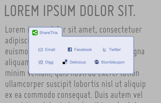
Despite having long since reached the mainstream, social media has yet to connect to many active websites that could truly benefit from making their content sharable. Social media sharing tools are an assumed feature in any site we build now, but what about the many sites that were built within the last few years? Fortunately, this is something that any site administrator can integrate without needing to know any code or even contacting their developers. ShareThis is one of many free social media sharing plugins that allows you to customize the look and feel of the menu, as well as what social networks are included. Once you’ve configured your menu, ShareThis provides a simple, embedable code that you can paste in to your content.
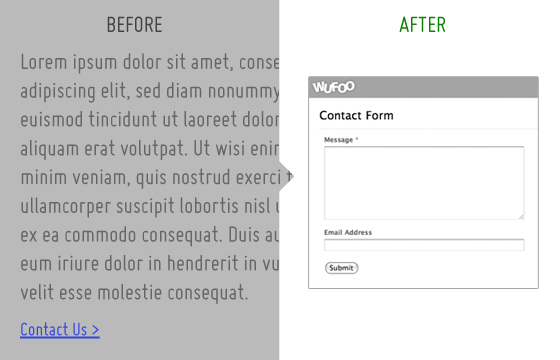
I continue to be amazed by how often I see direct links to email addresses on the web. This is a serious no-no for all kinds of reasons, most of all that it leaves your email address vulnerable to spambots that troll the web looking specifically for email addresses to add to their lists. Sure, it’s easier to create a mailto link than to write the code for a functional contact form, but what if you could configure a form with some basic options and embed it on your page? That’s exactly what Wufoo offers. Their web-based tool allows you to create up to three contact forms for free (for more forms, they offer four different pricing tiers) using a simple interface to assemble and name your fields. You provide the address you’d like your form data and alerts sent to, and then Wufoo will provide the code you need to paste into your page. This will take you several minutes to set up- far less than the combined hours you’re likely to spend filtering out all the spam you receive because of those rookie mailto links you set up back in 2001.
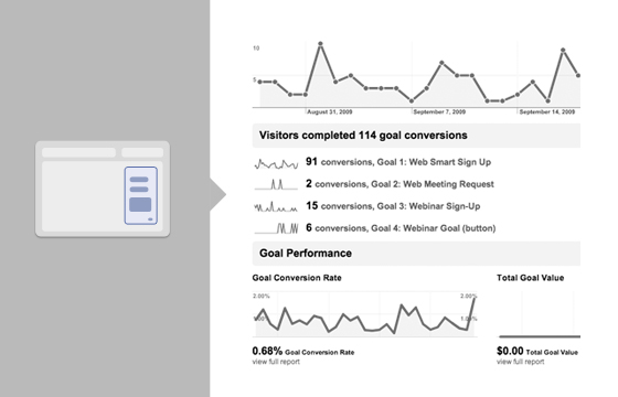
If you do already have forms set up on your website, getting them configured as goals in Google Analytics is a must. The way a goal works is that you provide Google Analytics with the URL for the “Thank You” page a user would be directed to after filling out a contact form. By submitting this URL, Google will be able to track the number of users that complete forms in your analytics reports. Remember, because a human user actually has to complete a contact form, Google has no other way of knowing how many times a user gets to the “Thank You” page unless you provide the URL directly. Most of the forms we build for our clients will already have two means of tracking their completion: The primary means is usually to store the completed form data in the database, and have it be viewable and retrievable using the CMS. The second way is to send out an email alert to the webmaster every time a form is filled out. These are very helpful for keeping track of these contacts and following up with them, but adding the Google Analytics goal will provide even more value long term. For example, say you wanted to build a custom report in Google Analytics that showed you only visitors who came in from Google organic search results in the month of January and ended up filling out a contact form on your site. If you haven’t set up the goal, your analytics report will be missing that last metric. Convinced? Check out our newsletter on How to Use Google Analytics for instructions on how to set up a goal.
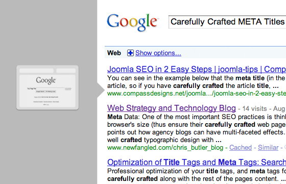
Before you read this paragraph, open up your website and go to your “About Us” (or equivalently named) page. What do you see at the top of your browser? Does it say “About Us?” I truly hope not. Listen, “About Us” means nothing. Guess how many “us’s” there are in the world? I just Googled “About Us” and retrieved over 1 billion results. If your about us page title is “About Us,” think about making it something more specific, because let’s face it- nobody searches for “about us.”
The title tag for a page is the primary information that a search engine will look at when indexing and valuing the authority or relevance of a web page. It will appear at the top left of your browser for the page currently being viewed, and as the linked title in a search result snippet. In the case of this article, the meta title is “Simple and Free Website Upgrades.” The title tag should be different from the page title (“Things You Can Do to Improve Your Website Right Now” for this page) and should be the main subject of the page’s content, or its “thesis statement.” In creating a title tag, you should consider other factors as well, such as specific industry jargon, the effectiveness of competitors’ titles, location (for local businesses), and the likelihood that a phrase might actually be queried in a search engine. Also, your company name or domain name is not necessary to duplicate and include in the title tag. Remember, the title tag is there to help a search engine connect your content with a person who is searching for your product or service, but does not yet know about you by name.
Next, I’d like to review some things you can do to improve your website that require a little investment.
%leftsidebar%
#macro:bloglist,3066,agencies#
I often remind our clients that their website is the most important communication tool they have. What puzzles me is how often a discussion about budgeting for website maintenance brings to light that they actually allocate more funds for employee cellphones than they do for their website! This is completely backward; a cellphone may connect you with another person directly, but a website can connect you with many people simultaneously. When you look at the value these two communication devices offer in that way, it makes sense to budget more for ongoing website upgrades, above and beyond the cost of its initial design and build, than for cellphones.
There will always be small tweaks that you can make to your site at no cost, like those I listed on the previous page, but there will be many opportunities to use valuable new technologies and techniques on your site that, while potentially costly, will add significant value to it. The list below includes some upgrades that we routinely recommend that our clients implement; I’ve ordered them from what I would expect to be least expensive to most expensive.
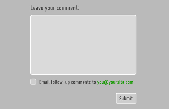
This feature is actually implemented more rarely than I’d expect. In fact, I had a hard time finding a site that I frequent that has it (even ours doesn’t have it yet, but don’t worry, it’s coming). However, I really appreciate it when an article I comment on gives me the ability to follow future comments. I tend to comment on several articles per week, so without this feature, I’m likely to forget which ones and miss out on a good conversation after I put in my two-cents. If you’ve got commenting functionality, make sure you give your readers the ability to follow the thread.
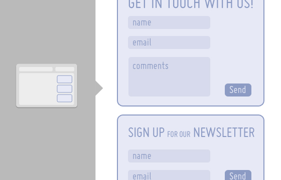
If your website exists to market a product or service, then your goal should be to get your visitors to engage with you in some way. Perhaps that’s simply to contact you for more information, sign up for a newsletter, register for an event, or download a whitepaper. Whatever your calls to action are, make sure they are clearly identifiable, simple to understand, and easy to respond to. Have you ever gone to sign up for a newsletter but gave up when you were faced with fifteen required fields? Why do they need to know your dog’s name anyway? Follow this simple maxim: Don’t ask for more information than you need. Notice that the ‘Sign Up for our Newsletter’ form above only asks for the user’s name and email address- you could probably pare it down even more by removing the ‘name’ field. Keep in mind that if your content is sincere and compelling, people will want to engage with you more, so there’s no need to veil your calls to action in unclear language or obscure them with fancy images meant to hide the fact that a user is heading right for a form. Mark them clearly, focus their titles on the action (think “sign up,” “register,” “join,” etc.), and don’t forget to thank users once they’re done.
See some clear CTA’s in action:

|


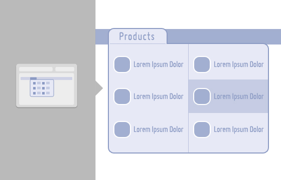
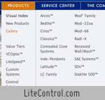
I am convinced that as the technical capabilities of the web increase, its visual properties will become more and more important to how we engage with information online. Many people tend to scan through navigation systems to get an overview of available options before choosing a path. Designing drop-down menus with navigation-oriented users in mind can yield some exciting interface options that are much more dynamic and compelling than the average list of text links. Many supermenus will have multiple columns and even images in line with the navigation options. This works especially well for sites that want to bring a collection of content that might ordinarily be organized within a third level of sub-navigation closer to the “surface” of the site.
See some supermenus in action:
|


In the second part of our recent article on The Future of the Web, I noted that as of March, 2009, a total of 21.4 million iPhones had been sold, roughly 30% of which were sold in the United States alone. That’s a lot of people using the iPhone! And guess what, many of them are loading websites using the iPhone Safari browser, which renders sites nicely, though shrunk down to fit the 320 x 480 screen. Creating an alternative template for your site that is designed for the iPhone’s screen would be a great way to make sure that its users actually get some value from your page. This might involve simply identifying a separate CSS file, or could get as specific as isolating only certain content configured specifically for iPhone use. Recently, Smashing Magazine assembled a mega-list of iPhone-specific site templates. Make sure to check out our friends at Viget Labs, who did a great job narrowing the iPhone version of their site to only the most important information a mobile user might want to see.
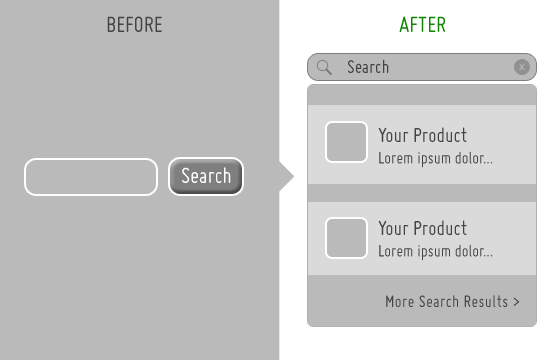
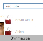
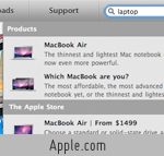
Above I mentioned adapting drop-down menus to give more information to users who were inclined to explore a site by scanning through its navigation menu. While some tend to interact with websites in that way, others are more search oriented. Many large-scale websites, like Apple and Amazon, have created truly innovative search tools in order to make the vast amount of content on their sites more accessible to users.
Rather than forcing users to engage with complicated filters or page after page of listed search results, the more efficient approach is to create an advanced search tool that retrieves and categorizes results as a user types their query into the search field. For an impressive example of this, check out Apple.com and search for “laptop” in the field at the top right of the navigation bar. By the time you’ve typed “lap,” you’ll already see images and descriptions linking you to all of Apple’s laptops, as well as their laptop accessories. If you don’t happen to see what you were looking for in the immediate results, click the link at the bottom of the window that says “View All Search Results.” You’ll be redirected to a comprehensive categorized list of all laptop-related content on the site. This tool is so well built, though, that chances are good that you’ll rarely find yourself on the “all search results” page- you’ll have already gone directly to the content you were looking for.
See some advanced search tools in action:
|
Related Posts
-
https://www.youtube.com/watch?v=pRKG4Gr9HOU The Benefits of Specialization Diana Fryc traces the origins of her current role as…
-
Tune in for great insights from the folks who have dedicated themselves to implementing better…
-


Empathetically and generously educating the specific audience you serve is what marketing is. You need…