Question: Why don’t the colors on my website match the colors of my printed brochure?
Answer: Matching colors from print to web is challenging because of the two different mediums. Colors in print are created by visible light reflecting off the surface of a pigment (ink). Images are produced by either CMYK (a full-color, four-ink process of cyan, magenta, yellow and black) or with spot colors (i.e. Pantone). Images on the web are generated by a light source (computer monitor) combining red, green and blue (RGB) from the visible light spectrum.
The range of colors (or gamut) that can be produced by ink is
different than the range of colors that can be produced by a light source. Here’s an in-depth explanation for those who crave more technical data.

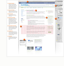
Adobe Photoshop (Newfangled’s web design tool of choice) approximates color matching through its Color Picker. There
are several color libraries available through the picker, such as the
Pantone Color Matching System (PMS). You can also enter CMYK values as
numeric values. Photoshop takes these color values and interpolates
them into RGB color for the web (highlighted in yellow below).

In addition to matching colors from print to web, matching colors from monitor to monitor is difficult as well. No two monitors are calibrated exactly alike. One monitor may have a warm, yellow cast while another may have a cool, or blue cast (like the difference in color casts between an incandescent and fluorescent light bulb). These color casts will affect all colors on screen and a particular cast is generally unnoticeable unless you place two monitors side by side for comparison. Most monitors can be calibrated to a baseline using software that came with either the monitor or the computer’s operating system.
Related Posts
-
I recently wrote an article for HOW's Interactive Design site about the history of computer-based fonts and how "web-safe"…
-

For this post, I've created a diagram of one of my recent website style sheets…
-
In this episode I interview Chris about our upcoming webinar on 7 Techniques for the…