In this month’s newsletter, Chris Butler wrote a great piece focusing on the importance of storytelling on the web to market your product or service. Towards the end of the article, Chris points out how user interfaces can actually support the role of storytelling, keeping the visitor engaged in the content while encouraging them to continue their session on the site. A couple of his examples included the new related content features that The Wall Street Journal and The New York Times are using.
I decided to take some time to look into current trends and see if other sites are following these same ideas. Are other popular sites reducing the amount of design and clutter in their user interaces, allowing the user to focus on the story? Are they using well-placed calls to action in their user interfaces that encourage engagement without causing distraction?
Here’s what I found…
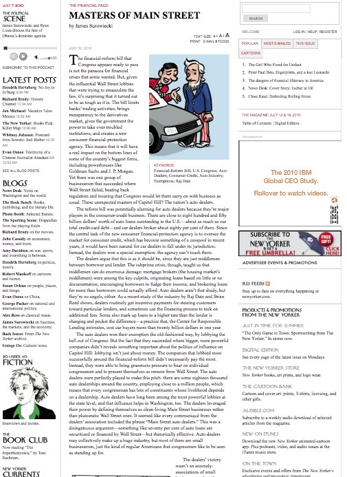
The New Yorker Magazine’s website apparently did not get the memo. Not only is the story crammed into a long narrow section that is sandwhiched between two seemingly never-ending columns of widgets and calls to action, but they cast such a wide net of distractions that I end up ignoring it all.
The example to the left is a news story about the financial-reform bill. Among the sidebar items on this page were things ranging from a CTA asking me to put together jigsaw puzzles of their magazine covers, to “Finger Painting” – a widget featuring this week’s featured iPhone sketch. These were not relevant to the article I was reading, and therefore proved just to be distractions from the story in which I wanted to engage. However, if I wanted to get a free umbrella by subscribing to the magazine, there were THREE separate places on the page where I could do so.
Not only is this unnecessarially repetitive, but it just doesn’t make sense. The New Yorker Magazine has an digital edition that you can subscribe to, and if I am already reading their online articles, then I am more likely to spend my money to see the full online version than the print version, yet none of these three call outs mention that with my subscription, I also get access to the ditigal edition. These calls to action could be improved to better target their reader.
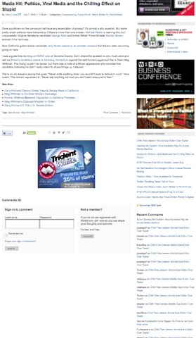 Almost as poor of a user interface for reading content is Wired Magazine’s website, particularly their blog. In the screenshot below you can see how a short four-paragraph blog post has sidebar items that stack up to over four times the length of the story itself (click on the image to see the full length of the page – I cut it off to save space!).
Some of the calls to action in this sidebar are relevant. For example, if I’m reading a blog, I may be the type of person to own an iPad, so advertising Wired Magazine for iPad might be a worthwhile distraction from my story, but once you get down to the tag cloud, the full list of categories, advertisements, and the unnecessary hit counter (I had to check the calendar, I thought it must be 1999), it’s just a little too much to handle.
Now by no means am I trying to say that every site has to remove all of their widgets and sidebar items that are part of the user interface. In fact, there are some sites that use these items well. These elements can be used to encourage continued engagement with your site and your brand without distracting the user from the story.
The Winners
One good example of this that I have found is from Viget Labs. They run four blogs, and all four contain similar interface elements that support the story, however, the one that I think is the most well designed is (by no surprise) the designer’s blog.
The blog has four simple sidebar elements that stay relevant and aren’t overwhelming or distracting. 1) An “about us” blurb telling you which blog you are reading, and that Viget has others you may find interesting, 2) A recent comments box that only features three comments and ties in a link to subscribe to the RSS feed without creating a separate item, 3) a “top posts” box that only displays the title of five posts, sortable by favorites, most views, and most comments (some sites had a separate element for each of these), and 4) a simple contact form.
The next example of a great user interface that does a good job of complementing the story of the page without totally abandoning the idea of CTAs and other features sharing the same page is the blog from A List Apart.
They give the main content area plenty of space, making it easy to read and it doesn’t appear crowded or cluttered by the other items on the page. The user interface is clearly designed for the user to focus on the story of the blog. The illustration also draws you into the story.
In the sidebar, most of the widgets support the story at hand. There is the list of categories that this post falls into, there is a short 1-sentence “snapshot” of what the blog is about, then of course there are a few CTAs, but none of them are very design-heavy nor do they force you to take your attention off the story, but they are there if you are interested.
Lastly, I wanted to point out the user interface of the articles for Seed Magazine online. The treatment of the text (font, spacing, layout, etc.) makes these articles particularly easy to read. The illustration draws you in without crowding the words on the page as well.
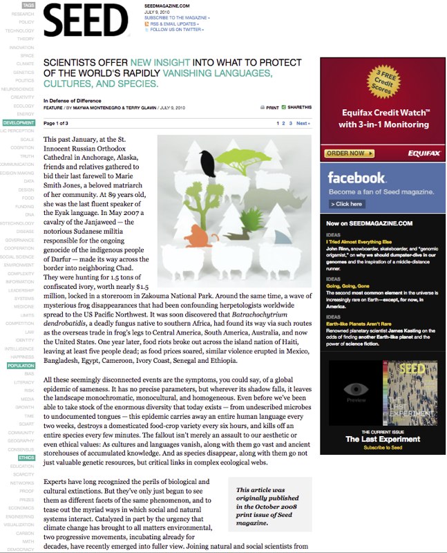
I like their treatment of tags on the left. Only the tags that this article falls under are highlighted – the rest seem to just fade away into the background. The left sidebar is a little heavy for me, as it contains three solid-colored boxes that stick out on this otherwise soft layout. However, there are only three boxes, and two of the three are relevant ways to engage the user within the site. That is a higher percentage than some of the other sites I looked at.
I’m sure you may have different opinions on what is a good/bad user interface and what distracts you from the story and what helps support it. I would love to hear your suggestions on what sites you visit have user interfaces that add to the value of the story while keeping the user engaged in the site.