
Millions* of people worldwide are accessing the web using mobile devices. Until relatively recently, the user experience was barely worthwhile, but devices like the iPhone, Android phones, and even the Google Nexus One have changed all that. Their larger touchscreen interfaces allow users to experience much more—and consequently expect much more, too—from the web. Mobile device adoption rates may be bewildering, but they leave no doubt as to the reality that soon, most users will access the web using them rather than a desktop or laptop machine.
If you haven’t given any thought to how your website appears and functions on a mobile device, now is the time to do so. Fortunately, the web platform used by the devices listed above has been built to handle the existing web quite well, making it likely that your site will at least be functional on an albeit much reduced scale. So rather than facing a complete rebuild of your site in order to stay current, conceiving of a smaller, functionally-limited version of your site for mobile devices is your wisest first move.
This month, I’d like to give our readers a preview of our mobile development program, and in doing so, outline our process for optimizing an existing website for mobile use.
*As of the latest 2010 sales reports, Apple has sold 51.15 million iPhones since they launched the product in 2007; 8.45 million Android phones have sold since their release in October, 2008; 135,000 Nexus One phones have sold since its release in January 2010; and over 1,000,000 iPads sold since March.
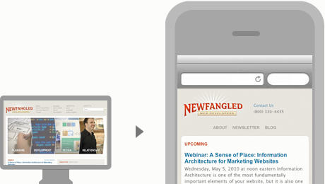
Optimizing Existing Sites Rather Than Building New Ones
Instead of completely rebuilding an existing website—or building an additional, entirely new website for that matter—we create alternate templates that adapt page layout and reconfigure content when the site is accessed using a mobile device. Aside from being the faster, more efficient, and less expensive development method, taking this approach is much easier from a content perspective. Since only the template changes, you don’t have to create alternate mobile-specific versions of any content; you can go on using your site just as you did before.
These alternate mobile templates are designed specifically to be compatible with the WebKit platform*, an open-source web browser engine that is currently used by Apple’s Safari browser and its mobile versions (for iPhone, iPod touch, and iPad), all Android devices, and Google’s Nexus One phone. We intentionally chose to develop for WebKit because with such a broad scope of compatible devices, it is quickly becoming the industry standard for mobile development. In other words, developing for WebKit will ensure the most consistent user experience accross the broadest spectrum of devices.
 *Accordingly, all illustrations of functionality in this article show a generic device, rather than an actual iPhone/Droid/NexusOne. However, we expect that the majority of our audience will, at this point, be using an iPhone.
Thinking Small
For most marketing sites, creating a few alternate mobile templates can be a fairly comprehensive solution. However, some more complex page templates may not transition so easily to the small screen. For an initial foray into mobile development, we recommend limiting alternate templates to around five, focusing on the information that would be most useful to users accessing your site from a mobile device. Sites with larger numbers of unique templates tend to have pages with a level of complexity that wouldn’t conform well to the reduced real estate of mobile device screens anyway, particularly if functionality on these pages is interactive and unlikely to be used while “on the road.”
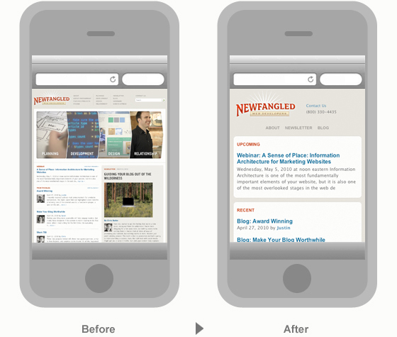
In the illustration above, you can see how difficult our standard homepage (shown on the left) would be to read and navigate on a mobile device. However, the mobile version of our homepage (shown on the right) isolates the information we believe is important to be available to a mobile user: contact information, navigation to our About, Newsletter, and Blog pages, and a list of upcoming and recent site activity.
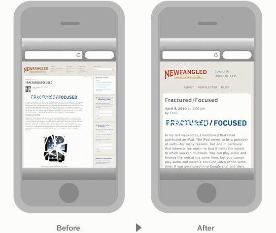
In this illustration, our standard blog page template (shown on the left) is compared with its mobile version. We’ve reduced it down to the article alone, removing all sidebar material and relocating some of it to the bottom of the page (offscreen).
Once you’ve identified which types of content you want to make alternate mobile templates for, you’ll need to give some thought to how that content is best displayed on a much smaller screen, and how to optimize it for touch interaction. Because vertical scrolling has been made so easy on mobile touchscreen devices, we generally recommend moving any subpage navigation, related content links, or calls to action that are preserved in your mobile templates to the bottom of the screen. To make it easier for users landing on a page to get an initial overview of its content, we truncate longer articles so that the elements moved to the bottom of the page can be seen right away. If a user wants to read the full article or its comments, she can tap the “more” links, which expand the page without having to reload it. This solution is a simple, quick, and more satisfying way to consume and interact with content in a mobile environment.
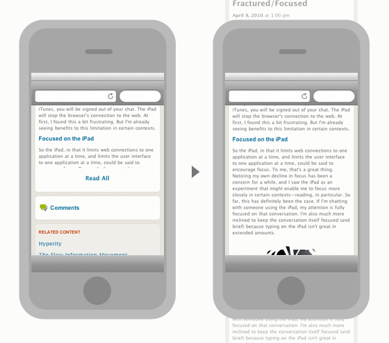
On the left, our blog page’s mobile template loads a truncated version of the article, bringing the comments and related content closer to the top. By tapping the “Read All” link, the user can instantly load the full article (shown on the right) without having to wait for the actual page to reload in the device’s browser. Expanding the comments area works in the same way. The top and bottom of the page are ghosted to give you a better sense of how the page scrolls vertically.
Pocket Productivity
Because we believe in building effective data- and lead-generating websites, retrofitting public-facing site content is only one piece of a worthwhile mobile solution. If you rely upon your website to generate leads, you’ll want to be able to access that information wherever you are. Additionally, if you’re like most of our clients, you’re probably working with your developers routinely—perhaps even on a daily basis—to continually expand and refine functionality. In other words, productivity surrounding your website is essential. That’s why our mobile offering includes two additional elements: mobile versions of the NewfangledCMS Advanced Measurement Dashboard and the My.Newfangled.Com client-facing project management application.
If you’re unfamiliar with our advanced measurement dashboard or our client-facing project management application (My.Newfangled), you can read all about both tools in our newsletter from August, 2009 on Coping with Complexity.

Below are a few screenshots of the mobile version of our dashboard. We’ve packed five of the most important reports in to a light and fast mobile application. Once logged in, you can review an up-to-date page views report, as well as a general stats report that will keep you in touch with the pulse of your site when on the go. You can also dig in further to view your new leads, top sessions, and current keyword rankings.
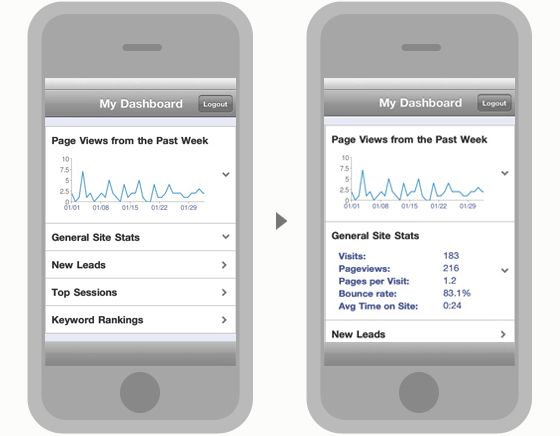
Our NewfangledCMS Advanced Measurement Dashboard has been adapted for mobile users, too! Now, anyone who updates to the latest version of the NewfangledCMS with the mobile module can access their marketing dashboard to check on general site statistics, any new leads that have come in, current top sessions, and an up-to-the-minute report on keyword rankings. The illustration above shows the dashboard landing screen and the general site stats that can be expanded without reloading the screen.
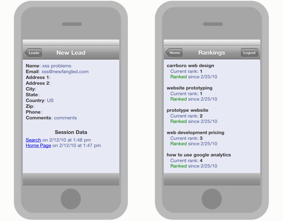
Additional dashboard screens include a detailed report of new leads and a keyword rankings report.
Our active clients refer to their My.Newfangled.Com accounts to track progress on their current projects and communicate with their Project Management team. Now that we’ve created a mobile version, this application can be accessed from anywhere!
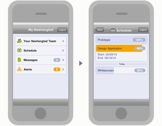
Your mobile My.Newfangled.Com account includes contact information for your team, a current progress report, any messages to you from your team, and any system alerts from our tech team. The screenshot above shows the home and schedule screens.
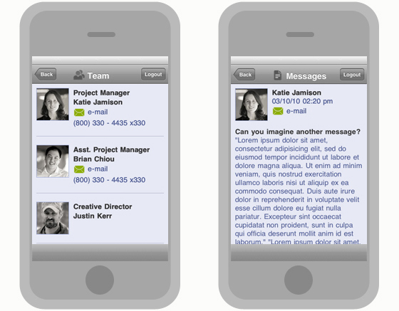
Additional screens for the mobile version of My.Newfangled.Com include details about your team (shown at the left) and any messages they’ve sent you (shown at the right).
Getting Started with Mobile
Mobile technology is still in its early stages of growth and innovation. As mobile devices become more sophisticated in their functionality and more widely used, we’ll begin to uncover new ways to focus what we do online more specifically for the mobile context. In the meantime, taking an initial step to adapt portions of your website for mobile use will give you that first experience in thinking more particularly about the mobile user experience that you’ll need in order to keep current with the trajectory of this technology.
We’re very excited to be able to offer mobile-specific capability, especially as part of a comprehensive package that addresses the user experience of our clients, and our clients’ clients! With a mobile-optimized site and mobile versions of the analytics and project management tools our clients have come to rely so heavily upon, we’re confident that our mobile suite will be the best first step our clients can take. If you’d like more information about it, get in touch with us by using the “Let’s Talk” form on the top right-hand corner of this page, or just give us a call at (800) 330 – 4435.
Related Posts
-


Christopher Butler will be a keynote speaker at the 2015 ConvergeSE conference...
-


Chris Butler will be speaking at the concluding session of the AIGA's Web101 course...
-
Chris Butler is MC'ing at this year's Hopscotch Design Festival...