
I’m a born planner. I take much more pleasure in creating a to do list than I do in actually completing the items I’ve painstakingly color-coded and arranged in order of importance. My downfall as a planner? I tend to get caught up in the small details before the bigger picture has been decided.
Every time we move, which has been a lot over the past two years, I immediately begin to envision the new space in my head as it would be in my dreams: repainted kitchen cabinets, warm colors and a collection of my favorite (yet to be purchased) framed prints in the place of stark, white walls, charming pieces of vintage furniture combined with some modern pieces to make my husband happy, a little orange teapot on the stove…yes, I envision the teapot. But before I’ve taken a step back to look at our new home- deciding what furniture will actually fit in the rooms and how it should be arranged to make the most of our space- or to look at my wish list- deciding whether it’s worth the time and effort to achieve each item and creating a timeline for doing so- I’m off buying prints, performing daily searches on craigslist for vintage furniture, and spearheading a never-ending online pursuit for the perfect orange teapot…it’s very elusive. After all, isn’t the horse supposed to walk behind the cart, nudging it along down the street with it’s snout?
Well I can tell you what that method has gotten me thus far: a stack of four vintage chairs in our attic waiting to be repainted and reupholstered, a kitchen sans cabinet doors (they’re keeping the chairs company) and at least four unframed prints lying around without a home. And I can tell you that using the same method certainly won’t lead to efficiency in web development projects either.
A much more effective method is our grayscreen prototyping process, established long before I crossed the Newfangled threshold as an employee (in fact, it has a good ten years on me). Consequently, there’s already a wealth of information on our website about why we prototype and how we prototype, so there’s not much to elaborate on there. However, within the process of the prototype lies nuances that can determine whether it’s destined for greatness- a well planned, effective website that meets the client’s expectations- or doomed to fail- a big ol’ mess.
The goal of our prototypes is to thoroughly represent the architecture of the planned site- specifically the structure, content, and functionality. After all, not only will the developer and designer be using the prototype as a guide for their work in later stages, but the prototype is used to determine the scope of the project in functional, interactive terms as well. As a general rule, when it comes to functionality, the more specific the better. If the client wants forms that expand when the title is clicked, this should be represented in the prototype. If they’re expecting a scroll feature that showcases their products, it needs to be represented in the prototype.
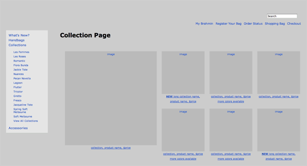
In one of our more complicated prototypes, clicking on a collection title resulted in the pop-up window shown above. With this prototype, it was important that the client be able to accurately see what the customer would experience as they navigated the site in order to make decisions about functionality. Of equal importance was specifying how those agreed upon pieces of functionality would work on the site so the developer and designer could do their jobs well.
To the extent that it is beneficial, we want the client to be able to click through the prototype and experience, as closely as possible, how the website will actually work once built. But, not only is it important for us to have this expectation ourselves, it’s of equal importance for us to communicate this expectation to our clients and make sure they have it as well. They need to understand that when it comes to the prototype, design aside, what you see is what you get. Once the prototype is approved, any additions threaten not only the development schedule but the budget as well. The last thing a client wants to hear is, “Well, we could have included that on the website, but it wasn’t specified in the prototype, so adding it means pushing back your important deadline” or worse “…it wasn’t specified in the prototype, so we’ll have to add it as an upgrade after go live at additional cost.” However, there are aspects of a prototype that we intentionally make less specific.
While our prototypes will certainly fully represent the structure, content, and functionality of a website, they will not speak to elements such as color, graphics, or typography. It is precisely because we want clients to focus on the former that our prototypes are intentionally design-agnostic. In fact, if you look at the prototype expecting to be blown away by design, you’ll probably be a little underwhelmed to say the least. I like gray as much as the next person, maybe more, but I wouldn’t consider shades of gray to be a very exciting palette for a website. But the shades of gray allow us to draw the attention of our clients to the elements that matter during this phase – and keep their attention from those that don’t. We use the same basic font across the board- only occasionally adjusting the size and weight to represent how items will relate to one another on the page when appropriate- shades of gray as the color palette as referenced earlier, and dummy text wherever allowable. Introducing stylized fonts or color at this phase may cause the client to get attached to certain aspects of how the prototype looks instead of focusing on how it works. Furthermore, being too specific with some of these elements can even be problematic when it comes to actually building the site.
I mentioned that we use dummy text wherever allowable, a sign to the developer that the client should ultimately have control over the actual content. Straying from this convention and entering specific text on prototype pages, such as actual page titles in lieu of something more generic like “Product Detail Page,” may send the wrong message to the developer. Does the client want the titles to be hardcoded? Is this page different than a standard product page in some way? While these specific questions can be answered by a simple phone call, this may not always be the case. Regardless, the prototype is a means of communication between all involved parties- the client, the project manager, the developer, and the designer- so shouldn’t we be trying to use it to enhance that conversation and not introduce more confusion?
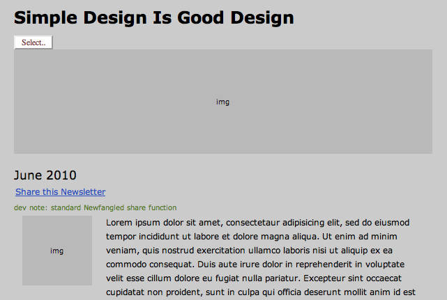
Even a small detail like using more detailed page titles instead of generic ones can cause confusion. As a general rule, if there isn’t a good reason for being specific with elements of the prototype, keep it generic.
It’s important to note that there aren’t necessarily hard and fast rules when it comes to developing a prototype. The way you choose to handle certain elements may be determined by the client rather than any set of rules as to when or when not to be specific. For instance, in our prototypes, areas designated as open content areas have a great deal of flexibility with regards to the formatting that’s possible through our NewfangledCMS; images and files can be uploaded and bullet lists and hyperlinks can be created. Typically, we would write a small amount of “lorem ipsum” text with a note to the developer that a certain area is open content. However, some clients may get derailed by the length of text in these areas or the absence of bulleted lists if their content calls for them. In this case, it may be better to include some bulleted lists in the prototype so that the client is able to focus on more pertinent aspects of the prototype while keeping the note to the developer to prevent confusion.