
Introduction
Over the past year, we’ve made quite a few changes to how we create websites. Change, of course, is something we’re accustomed to; it’s a necessity to practicing something as subject to technological change as website design for 18 years and counting! But the last year in particular has brought about many adjustments to our process, and each one has only strengthened my conviction that design is as important and central to this business as ever.
As a result, design has been on my mind constantly, and I’d like to offer you some thoughts about design and process. I’ve been fussing over this for a good while now, and yet I’m still not fully convinced that it’s entirely shipshape. I guess that’s my way of warning you that what lies ahead may be a bit…messy. But we’re talking about design, and design in the real world can only be so clean. So, perhaps messy is appropriate.
I’ve organized my thoughts into the following sections, starting with some more abstract thinking about what design is as far as the web is concerned, and then moving into progressively more practical territory. Here’s a rough table of contents:
- Knowing Design
Understanding how design functions in interactive projects - Showing Design
How that changes how we demonstrate our expertise before we are paid for it - Distributing Design
On holistically design-centric workflows - Amending Design
How changes happen
You’ve got a long read ahead, one I hope will be well worth your time. So let’s put the coffee on, find a comfortable spot, and get started…
Knowing Design
Design is not a thing…
…but, there are no things without design. Though design is manifest in many visible, tangible things, design itself is difficult to see. That’s the power of design, but a stumbling block to those who practice it. When success is imperception, the desire to be seen and appreciated will thwart it every time. This is true of all applications of design, but especially so on the web. I’m going to try to show you why.
First and foremost, website design is not container design. In this way, it’s strongly differentiated from other applications of design. Let’s look at a printed book as an example. Once an author has written something, the designer’s job is to give that something a physical form. The designer has to consider a variety of issues — everything from typography to the dimensions of the book itself — in an effort to create a container that amplifies its contents. That’s the whole point: a book’s interactivity is one-way. It delivers information from one mind to another by way of a printed page, which means it must leverage a variety of object interactions and, essentially, make them disappear. A reader who thinks too often about the object in her hands is thinking too little about what it contains. Book designers know this. But they are also aware of the promotional function of their design, which requires the exact opposite kind of thought. A book must convert a prospective reader to a reader. It must seduce, whether it stands out among many on a shelf in a store or a grid of thumbnails on a screen. For this function, its design must do everything but disappear. As information delivery systems, websites obviously share many of the design characteristics of a book. But, there are also major differences to consider.
Unlike a book, a website’s content is always in a state of flux. This requires a different approach to design. Whereas a book designer’s task is to give physical form to an already complete, fully realized text, a website’s design must account for an evolving “text,” most of which has not yet been written. This has recursive effects on a website’s form and function. As a colleague recently said to me, “book design reflects content; web design anticipates it.” This would be true of a book, too, if it engaged writers and readers in the same way as a website. It would make for a book that was always getting torn apart and rebound; reordered and re-annotated; getting larger and heavier and messier. The Hulk in a onesie. Not cute. But printed books aren’t like that. They can’t be, because they are paper and ink and glue and cloth bound together like they mean it. Websites, on the other hand, are “re-printed” every time you call them up on the screen. So, they require a structure that is as elastic as it is invisible. But that elasticity is not just limited to an inside-out growth pattern. Websites also must adapt to their context — from the outside in. That’s what responsive design is all about. Printed books don’t have that, and I’d wager our current understanding of the laws of physics will keep it that way for a good while. And while websites have the same, if not more, promotional considerations as printed books — indeed, some websites exist for marketing purposes alone — they typically require the same design subtlety as their content does. A website, too, must convert — first a prospective reader to a reader, then perhaps a reader to a buyer — and yet, this conversion pattern evolves quickly from an impression to an education. It requires a deeper engagement with content than seduction alone can sustain.
But engagement doesn’t just happen. Engagement is the result of an experience designed to capture, hold, and preserve attention, not coincidence or good luck or even GIFs. A book, as we already know, captures attention with its cover. But how it preserves it has just as much to do with its physical properties as the quality of its content. A reader’s ability to focus on a printed book is object-facilitated. From cover to cover, there is only one experience to be had. Distraction must come from elsewhere — from outside the bounds of the book itself. Yet, on the web, any individual piece of content is just one of many blinking marquees, lined up side by side, competing for a user’s attention. Design carries this burden for content and is its only hope of gaining even a few moments of a reader’s time before another tab, text, or tweet becomes of greater interest. This is a subtle art. And really, it’s more of a subtractive process than it is an additive one.
Imagery is seductive; hence, how book covers work. With beautiful images and smart editorial copy, they say to prospective readers, “I’m special. I only do one thing, but I do it in a way that will change your life. I’m really, really worth your time.” Especially today, if a printed book is going to be picked up by a reader at all, it has to have made a successful positive argument for all of those things. But on the web, we’re working against an entropy that we designers have created by going overboard with visual seduction. Our strategy has been all cover and very little content — yes, even those sold on the whole content marketing thing — because we believe that seduction is our only means of getting our tiny page to matter among billions. But let’s face it, nobody is likely to believe that a webpage is truly special, or will change their life, or is worth hours and hours of their time. No, our argument is a negative one: “I won’t waste your time.” If we want people to believe that, we can’t try to seduce them. That’s a surefire way to lose their trust. Instead, we’ve just got to get to the point, as simply as possible. When a designer cannot maintain the balance between seduction and simplicity, design is always degraded. It becomes decoration. Take some time to study your favorite websites. What do you see? The more container you see, the less meaningful content there tends to be. Visual clutter is evidence of a failed search for clarity. It yearns to express design while only making it more inscrutable.
Sometimes the best design decision is to put nothing where something could be. We do know this — I really believe that — it’s just a shame we don’t practice it as often as we should.
All this is to say, design isn’t so much a property to be seen — literally — as it is to be known and perceived on the basis of other things. Which also means that for designers, knowing design and showing design are two very different things.
So, let’s switch gears and think a bit about showing.
Showing Design
“Could I see some examples of your work?”
This is a common enough request; expected, even. The subtext, of course, is, “Show me your best stuff. Assure me that you can create something that will make the right first impression.”
There’s a place for this, of course. After all, the value of making a first impression is not to be underestimated. But, at the risk of being pedantic, showing off your most attractive work is not showing design. It’s displaying outcomes. And really, without an explanation of how these outcomes have been reached, a portfolio is merely an index of taste or style. At most, it may enable someone else to discern if there’s chemistry there — a shared sensibility, if you like — but at least, it merely demonstrates that a designer has in fact been allowed to produce some things before. As a vetting method, it’s a profoundly weak one. Good design shapes itself to a variety of factors, least of importance being the designer’s taste or “style.” It’s a custom application of expertise, every time.
A gallery of finished work can no more elicit a sound judgement about design or a designer than any other purely visual experience — even getting a look at the designer himself, no matter how captivating his face-touching may be. It may give you plenty to react to — and perhaps in some particular cases that is enough — but images alone cannot create the level of understanding that is intended to be offered by galleries. Design is not just a visual practice, and so it cannot be expected to operate through optics alone. Design is perceived through use, and understood by communication. In order to truly understand the nature of a designer’s work, you’d really need to discuss it — how that work came about, for whom, and why. Unfortunately, ain’t nobody got time for that.
This is why selling “design” doesn’t work. It’s far too vague to make most people feel secure about embarking upon a long and challenging process, especially one that comes with a significant price tag. Talking about design alone is often too abstract, and talking about what design produces is too specific. Goldilocks’ problem.
But what about the process by which design expertise is applied, and from which emerge those pretty, shiny outcomes? This is the “just right” you are looking for. Process is something a designer should be able to discuss in a specific, coherent, and concrete way. Process makes people feel safe. It answers their real questions: What’s going to happen? How long will it take? What will I need to do?
Distributing Design
The trouble is, articulating a process still requires some way of showing when design is being done. And even that — when design is being done — is something I’m hesitant to say because once we head in the direction of thinking of design as a discrete task, we tend to want to call it something other than design. Like Visual Design, which understandably annoys designers.
There is no design phase.
Really, design is being done at virtually every point along a website project timeline. But saying that, however true it may be, is only likely to confuse people more. That leaves us with a couple of immediate options, neither of which are great. Option one is to be Willy Wonkaish about it: “It’s all design, Charlie! Every last bit of it.” That’s not going to work. Go back and watch Gene Wilder’s Wonka; he’s so whimsical it’s sinister!
The other option is to avoid the all-is-design message and limit our mention of design to only those instances in which we can “show” design in a deliverable. This is the standard approach, the “Design Phase” approach. But design is not a thing to be line-itemed, any more than “creativity” is. There are, obviously, discrete tasks and deliverables that often fall under the category of design, but as long as design is considered just one of many stripes on a Gannt chart, design — real, effective design — won’t happen. There are a couple of reasons for this. First, isolating design will isolate design expertise. Designers need a place at the early-stage-discussions table, where they can listen and contribute when their ears and eyes are most needed. Believe me, design decisions are being made there. Every design requirement is established by an early-stage decision, which makes every early-stage decision a design decision. Second, if design is isolated, it will just unproductively spill over into everything else anyway — as unnecessary stress over the aesthetic implications of early IA decisions, for example, or legitimate stress over the inevitable usability chaos that results from assuming that design is just putting a layer of shine on. A rule I’ve discerned from experience is that you’re going to talk about design all the time. It just tends to go better when you’re prepared for that.
So how can we express the process in a way that properly locates design?
I think it has to do with crafting a process that is anchored by decisions (obvious) and expressed in terms of commitments (perhaps new).
Here’s how that *might* look:
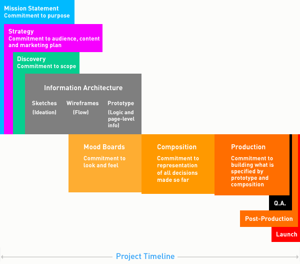
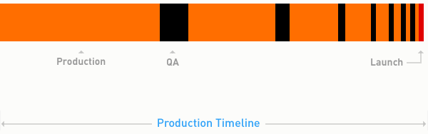
*Absolutely Necessary Caveats: I said might look, not will or should! The phases of this timeline are not necessarily in correct proportion to one another. In fact, this diagram is intentionally skewed to focus on the Information Architecture through Production phases. While the introductory phases (Mission through Discovery) are probably accurate in terms of relative length, the Q.A. and Post-Production phases are intentionally shrunk to fit everything within the width of this page. Keep reading for more detail.
A bit of explanation of these phases. (I’m going to keep this brief, so if you have any questions, leave a comment below.)
- Mission Statement
Commitment to Intent
This is where you’re articulating purpose. Who are you? What are you trying to do? For whom? How will you do it? It really helps to write this stuff down, whether as an official business plan or something more casual. I’m amazed by how infrequently this happens. - Strategy
Commitment to audience, content strategy, marketing plan, etc.
This is another big-picture phase. The idea here is to gather everyone who will influence the direction of your thing to make a solid plan for its success. Likely topics of documented conversation: personas, content strategy, marketing methods, personnel and responsibilities, measurement procedures. - Discovery
Commitment to Scope
This is often an extension of the strategic phase, but one that gets into much greater detail. In particular, you’d be narrowing in on a detailed assessment of the scope of work for an initial phase (from start to launch) as well as perhaps a more generalized idea of the scope of a potential phase two (post-launch). The goal here is not necessarily to produce an exhaustive functional spec, but to answer critical questions of how key objectives will be met and how to prioritize them given particular constraints like budget, timeline, etc. - Information Architecture
- Sketches
Commitment to Ideation
Of the many things paper and pencil are still quite good for, quick ideation is certainly at the top of the list. This sort of casual planning has a place in even the most serious development projects. Few things are as good at enabling the activation of creative thinking. As soon as you try to think creatively in front of design software or a text editor, the technology gets right in the way and fundamentally changes your thinking. Paper and pencil have that book-like object-magic of disappearing during use. - Wireframes
Commitment to Flow
Paper isn’t great at exploring interactions and outcomes, though. So the next step is to create wireframes that articulate the logical flow of information from one screen to the next. - Prototype
Commitment to functional scope, logic, and page-level information hierarchy
Wireframes aren’t detailed enough to carry a project into production, so that’s where prototypes come in. The idea here is to document information architecture as well as page-level information and logic in a way that can be used just as the final product will be used. The interesting thing is that with each of these IA planning methods, design is focused on information rather than aesthetics.
- Sketches
- Mood Boards
Commitment to Look and Feel
In parallel with Information Architecture, aesthetic decisions can be made. This starts with the creation of mood boards, which is really a method for prototyping imagery, colors, textures and typography, and how they are combined to create the right look/feel/mood of a website. - Composition
Commitment of Visual Representation of All Decisions Made So Far
This is the phase most often referred to as “visual design” or “design” or “design creation” or something like that. But really, it’s the application of the look and feel committed to in the mood board phase to the information architecture committed to in the prototype. It produces documentation in the form of annotated, layered, graphical composition files (for each unique template a website may have) that a developer can use during production. - Production
Commitment to Building What is Specified by Prototype and Composition Files
Ahh, finally: a straightforward phase. Coding happens here. - Quality Assurance (Q.A.)
Commitment to Verification
…of proper functionality, of design consistency, and of contextual consistency (i.e. proper function across browsers and devices). So, testing. A lot of it. By developers, designers, project managers, and clients. All eyes on deck. - Post-Production
Commitment to Alterations
Focused testing periods will produce new production work — bug fixes, change orders, etc. This is a scheduled period of time to address the lists of these items assembled during Quality Assurance. - Launch
Commitment to Being Done with Phase 1
Let’s just leave it at that for now.
OK, so that’s not all that revolutionary, is it? This sort of phased approach to a project is fairly commonplace, though I’m sure there are minor points within this particular outline that are new and/or improvements upon what some teams might be used to. I know that it represents our most recent in a long line of years and years of minor, learn-as-you-go adjustments.
But the main point is to reframe the progression of this workflow in terms that are fairly familiar to design. Namely, commitments. We want to see this not as a hard, step-by-step procedure — one step of which is design — but instead see it as a flow of design. It’s a holistic process carried by the momentum of design commitments, which produces certain deliverables that are, for many, the concrete things that “show” design.
Amending Design
Of course, this process isn’t truly one-directional. In reality, it moves back and forth quite a bit, especially in later stages.
But our tendency is to create workflows that assume uninterrupted, forward momentum. They can be expressed as:
Plan → Design → Code
When there are setbacks, we treat them as aberrations and go in to all kinds of reactive and unhelpful modes — expectation management mode, quibbling mode, blame mode, CYA mode. We’ve all been there. This is because Plan → Design → Code inevitably leads to Re-plan → Re-design → Re-code. And not just once. No plan is going to be airtight, and so no design or implementation is not going to need to be re-thought a bit once it starts being used. This is what testing is for. The idea that testing and content integration will lead to changes to how things were designed and built shouldn’t be a surprise to anyone. It should really be an expectation. So why don’t we plan accordingly?
Well, we kind of do. In the project timeline diagram I created above, there is a post-Q.A. production phase that precedes launch. The idea is that all of those understandable changes would be made then. But let’s look a bit more closely at that.
Here at Newfangled, we used to call that the “Tweaks Phase.” I’m not kidding. Let me repeat it in order to emphasize how ridiculous that sounds: “The TWEAKS Phase.” The word tweak is just a bit confusing in this context, isn’t it? Most people use tweak to mean a minor adjustment — a sort of small, benign, no-big-deal kind of thing — which is really quite weird because the original meaning of tweak was more along the lines of a sharp twist or pull. Sounds unpleasant, right? I suppose that’s the irony, because believe me, the “Tweaks Phase” gets unpleasant real quick. Why? Because there is no such thing as a tweak in web development. There are no tweaks. There are only bugs or change orders. Period. Both are expected. The only question is whether the change orders amount to work that should come with an extra charge. (I’m not going to go into that any further here other than to say, sometimes yes, sometimes no.) The real point of tension in this phase tends to be one of timing. Sure, there are going to be changes. But how and how quickly are they going to be done? And was that time and effort something that everyone expected at the outset? If not, tension.
So, do yourself a quick favor and banish the word tweak from the design, development, and client services lexicon. Actually, just get rid of it altogether. Permanently. After all, Post-Production not only sounds more professional, it suggests that you actually have a plan for what happens after people start using that thing you made for the first time and now want to change nearly everything about it.
So what might that sort of plan look like?
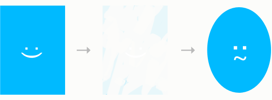
It probably looks something like this:
Instead of moving from production through quality assurance and into a post-production phase once, it’s far more likely that that progression will happen many times — in increasingly smaller increments — before launch. (Although notice how there is a limit to the shortness of these phases. They can only get so small before they’re essentially an ad hoc flow that is nearly impossible to manage, especially if your team is working on more than one project at a time.)
In fact, within your production phase are likely multiple Plan → Design → Code routines. Think, Powers of Ten — the more you zoom in, the more you’re able to see the intrinsic connections between planning, design, and implementation. It’s the DNA of interactive design, the building blocks, its irreducible complexity. It’s far more blended than a simple Gannt chart can visualize accurately, because what is post-production, really? It’s a multi-step procedure that reacts to what Q.A. reveals, comes up with solutions (Plan + Design), and then implements them (Code). In other words, Plan → Design → Code.
Rethinking design once you see it and use it — especially now that the possible contexts are so much more diverse — is inevitable since we’re still learning how we use different devices and interact with information contained by them. For example, we’re not used to “mobile” enough to be good at anticipating the issues that emerge from mobile device use before we implement. This is a bit of a shock to our systems, because we’ve created procedures based upon our years-tested assumption that we know how to design things for screens. So, testing is going to be a big deal, and is certainly going to lead to a pretty involved post-production phase. We need to be in the practice of preparing ourselves and our clients for that and making this workflow part of the roadmap we present at the beginning. We should expect to want something other than our first attempt once we start using it.
Endnotes
We started with a fairly abstract exploration of how design functions in interactive projects, and then worked our way down, deeper into how design and process work together to make projects happen successfully. In a way, we went from design to project management, didn’t we? I suppose that calls into question just how much the two overlap — how much design in practice is project management, and how much successful project management is the result of design thinking. I suppose I’ll leave that question with you. I’d love to hear what you think!