White space is not “empty” space, nor is it necessarily white. It is the unmarked area between elements on a page and is a critical component in good design. White space serves an important purpose; ignoring it can not only yield some unattractive visual results but also hinder content comprehension.
Balance
Imagine Beethoven’s Ninth Symphony with no rests between the notes. Or a 500-mile car trip with no food or bathroom breaks. Imagine trying to read this post with no spaces between the words. White space is just as important as the content itself; it gives the eye a place to rest. It helps give definition to, and provides balance for, the content it surrounds.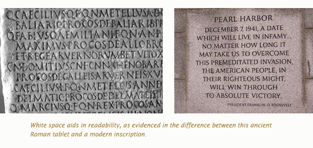
Comprehension
White space helps distinguish between different pieces of content. In the news business, space is a precious commodity — more so in print, but it applies to online news sites as well. Editors will often try and cram as much content as possible into a given space.
Here at Newfangled, our clients will sometimes tell us they want all their home page’s content “above the fold”; a term borrowed from the newspaper industry and not really applicable to modern websites. Never the less, white space is usually the first casualty.
On a content-rich page, white space assists in “chunking” the content into digestible pieces. It aids in comprehension because a reader can skim a page to find what they are looking for.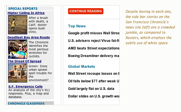
Highlighting
Adding some white space around a particular piece of content can give it prominence; help it stand out from the crowd. This can be even more effective than adding a bright color or drawing a box around the content because white space doesn’t add clutter to the page.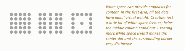
White space is like salt in a recipe. Leave it out and the food is bland; too much and the food is inedible. However, when used in proper proportions, you don’t taste the salt at all, just the enhanced flavors of the food. There’s no hard and fast rule as to when and how much white space is appropriate and the purpose of this post is not to provide a design lesson. The goal is to explain the role white space plays and promote its significance in design.