
Now that Eric, our former CEO, is off to new heights in his career, I’ve invited him to contribute a few guest blog posts. This is the first of a series that will be published in the coming months.

After studying at the Rhode Island School of Design, Eric Holter worked as an engraver and illustrator for Pagano, Schenck & Kay Advertising, then as a web designer at Leonard/Monahan. He founded Newfangled Web Factory in 1995. |
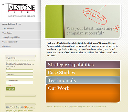
The Talstone Group is heading in the right direction with their website. They’ve already done the hard part, choosing a bold and narrow positioning statement (they specialize in healthcare marketing). They also have a site platform that includes a news section and blog so they have the means to employ a solid content strategy. But they seem to stumble in implementation of a content strategy that accords with their clear positioning.
Positioning: As already mentioned, Talstone specializes in healthcare marketing. Their portfolio shows many examples of work in the healthcare area. The only criticism I have of their positioning is their list of strategic capabilities. They list 53 distinct areas of service. For a six person shop this is seems like a stretch. Capabilities lists should usually follow the truism that “less is more.” If you have any distinct areas of service that relate specifically to an area of expertise, by all means list that. Otherwise a brief list of overall service categories is sufficient.
Content: Content is where this site falls short of its potential. First, the work section could use descriptive copy for each piece. So much goes into the final product of an agency’s work that there should be plenty to say. They do have an excellent case study under the “case studies” section. A few more would be welcome. They also offer an email newsletter for tips, information and white papers. I’d get this content onto the site. Most people at least want to see some samples before giving up their email address. Besides, it’s this kind of content that empowers a website.
The “News & Notes” section is out of date, the last news item is from November 2007. I’d guess that’s because they started their blog around that time and began paying it more attention than the news section. That’s fine, in fact I’d say agency sites that have integrated blogs could just go with a news category or tag and the separate news section out. In this case I’d just convert the existing news items to back dated news posts in the blog and kill the section.
The Talstone blog looks like it got off to a decent start, but posts have dropped off of late. I’d guess that’s because there wasn’t a strong content strategy behind the blog in the first place. The content of the posts consist of fairly random musings. Which is fine–general interest posts can add real personality to an agency blog. However, general posts ought to be sprinkled in among more regular, meaty, thoughtful, and professional posts. Since Talstone has a clear positioning statement they should be able to devise a corresponding content strategy–one that will demonstrate their expertise.
General content, or design oriented content is a common mistake for agency blogs and newsletters–especially when the agency doesn’t have a focused position. In these cases the time investment for generating regular blog posts becomes too great. It becomes difficult just to come up with subjects. And when the impact of the blog is so low it hardly seems worth it. Chris Butler wrote an excellent newsletter for Newfangled on developing a sustainable content strategy.
Platform: I don’t see any particular problems with the website’s platform. I can’t detect if there is a content management system underneath, but I assume there is since there’s a blog. As with most websites there’s a great opportunity to optimize the content for search by implementing unique, page specific title tags.
Design: I like the visual design, it’s clean, simple, easy to navigate, everything you hope for in a web interface. I get a little thrown off by the window shade navigation. The sections stay open even after clicking a new one–except when they don’t. And when a few sections are open at the same time it gets visually confusing as to which items are the main categories and which are the sub pages. It’s relatively easy to decode, but as Steve Krug insists about web design “Don’t Make Me Think.” Fixing the functionality so that only one sections stays open at a time and perhaps indenting the sub page titles would help. I also find that the diagonal line pattern in the main content area has a bit too much contrast on top for readability. All in all, minor criticisms for an otherwise well designed site.