
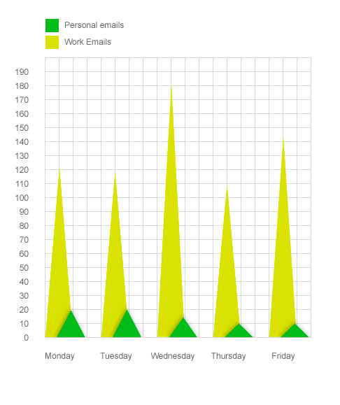
Below is a graph showing one work week’s worth of email received. I’m not sure why, but Wednesday was a big day for email. I’ll have to see if this is a recurring trend.
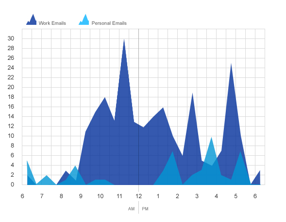
Below is a graph showing one day’s worth of email. Again, the spike is in the middle. But with this graph, I wasn’t surprised to see when the spikes were. I’ve always noticed that I tend to get a rush of emails right before lunch and right before the end of the day. Have you noticed any similar trends? Also, I think this is the prettier graph… just sayin’.
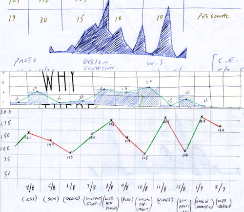
Update (04/03/2009): After seeing Alex’s comment (below), I thought I’d share some of the original sketches that I had in my notebook that eventually became the graphs like those below. Alex asked if I run some kind of script to collect and visualize this data. Sadly, my approach is much more old-fashioned and less sophisticated. I manually collect the data I’m looking for, sketch it out on paper, then create a graph using Photoshop. I wouldn’t mind a more automated process, but I also find this one kind of fun. (Note: the graphs sketched below also led to those visualizations on my post about newsletter tracking stats and my post about call to action response stats.
Related Posts
-


Christopher Butler will be a keynote speaker at the 2015 ConvergeSE conference...
-


Chris Butler will be speaking at the concluding session of the AIGA's Web101 course...
-
Chris Butler is MC'ing at this year's Hopscotch Design Festival...