Sarah and I have had quite a busy Fall so far. Brahmin launched at the beginning of September, PlanUSA got upgraded to the brand new CMS 5, and our newest site, Tracks & Trails, went live earlier this week.
Tracks & Trails specializes in planning Western Driving Adventures—RV and car trips to the American and Canadian West (and Florida!). Their experienced trip consultants are ready to help you chose or customize the perfect travel experience for you and your family. Whether you want to spend two weeks exploring the National Parks of the Southwest, just have time for a quick getaway to Yosemite Valley, or something in between, Tracks & Trails has the trip for you. The site was built by Jim and designed by Justin.
There is a lot of cool things to talk about with this project, including a robust Trip search and Google Maps integration. However, those will be the subject of a future post because today I want to focus on the design and identify some of the unique challenges and highlight some of Justin’s cool design elements.
About the design process, Justin says,
“This was one of the first sites to include mood boards, and we were still trying to figure out the best way to utilize this new tool in the design phase. The main challenge was to try to capture the essence of what Tracks & Trails provides to their clients and reflect that in the design. I was able to draw somewhat off my own experiences in RV travel. The goal was create visual interest with a bright color palette and engaging graphics without overwhelming site content.”
Two primary examples of this are the (soon-to-be-legendary) headset-wearing eagle and the iconography used for the trip navigation, which aid the user in how they want to find a trip, the core functionality of the site.
The Eagle:
Perched atop the main nav, waiting to take your call, is a majestic and helpful Bald Eagle. What was originally suggested as a joke, turned out to not only be a perfect way to visually set apart this global callout, but also a clever expression of the personality of the Tracks & Trails crew and the tone of the site as a whole. Travel might be serious business, but it is also supposed to be fun! (I won’t be surprised if all of our websites end up adopting their own animal mascots!)
Trip Navigation Icons:
Another important aspect of the design was the use of icons in conjunction with the Trip Finder navigation. Beginning with the homepage, we have these three buttons, which are immediate suggestions of how to begin using the site.
The use of color here subtly reflects the hierarchy of the site, and the icons are simple yet evocative.
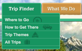
This iconography is carried over into the dropdown navigation of the
Trip Finder, summarizing the homepage options and providing some
additional choices. By including icons in the navigation it helps to
emphasize the importance of the Trip Finder to the use of the site.
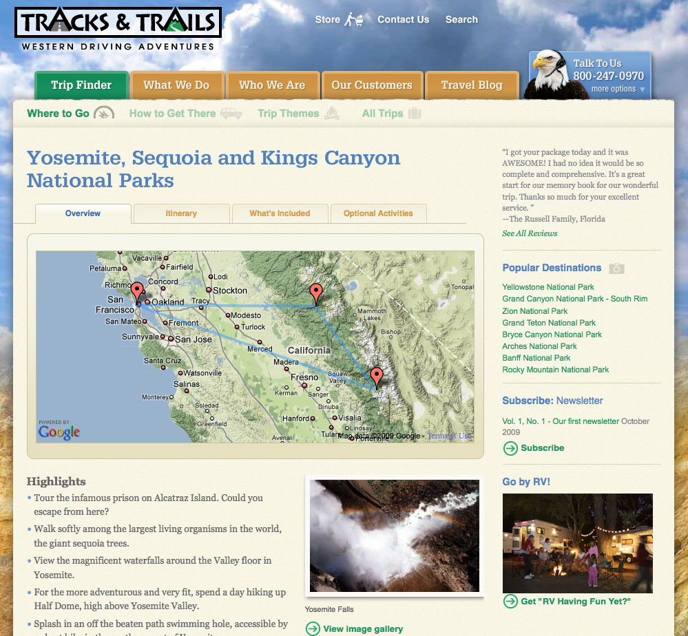
Another design challenge was how to handle very fine content granularity in certain parts of the site. Balancing general infromation, specific information and related information on a single page without losing focus can be very tricky. Information “layerng” also helped keep things under control, like the tabbed sections and the image gallery viewer of the the Trip pages. The Yosemite/Sequoia trip page shown below illustrates how Justin was able to pull all this together.