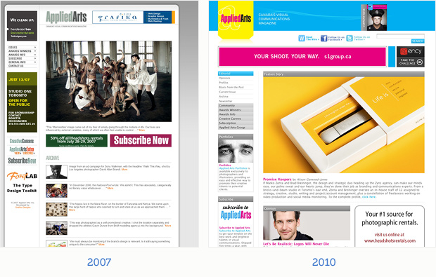
This is the first in a series of posts that we’ll all (hopefully) be contributing to which will highlight some recent website redesigns and expand on points from our most recent newsletter, “Is It Time To Rebuild Your Website?”
Applied Arts Magazine redesigned their website (along with their blog and e-mail newsletter) in January of 2010.
Content changes include a revamped editorial section with original articles, feature profiles and greater prominence for awards winners. Multimedia content was increased and social networking (Twitter and Facebook) was added. The new site is 15% wider, taking advantage of modern screen resolutions, and the overall layout is more open with better positioning of banner ads. A new CMYK color palette (a nod to their print roots) helps Applied Arts stand out among their competition.
This is a great example of a content-rich site that has been given a much needed face-lift, both structurally and visually. I love that Applied Arts has left the comfort zone of a “safe” color palette and made CMYK work for them.