For good reason, newsletters are a popular way to provide regular content updates on a site and collect basic lead information. A newsletter does not imply the frequency of content creation that a
blog does, but a newsletter is usually more substantial. As long as
regular schedule can be kept, with time set aside for writing, a newsletter can be an effective content strategy. In addition to spreading expert information to subscribers, the emails
themselves provide regular distribution of links back to the site,
accounting for the regular traffic boosts we see on our sites that have
newsletters. Chris Butler has produced some great resources on newsletter strategy, How to
Write a Newsletter, 4 Ways to Improve Your Email Newsletters and Managing
a Newsletter Campaign. I should explain that Newfangled sites typically do not offer the mailing mechanism and the email template creation function anymore; third parties like Constant Contact specialize in those services, but we encourage newsletter content pages, often with subpages, archives and commenting functions, and our CMS allows the easy export of email addresses and other form information.
This form information–your leads–comes from the newsletter signup call to action…a clear, visible callout telling users that a site offers regular updates of expert information, and that it takes maybe just a click and a few keystrokes to subscribe. These should be simple forms, as few fields as possible. In many cases the email field alone is enough. This call to action should be present across the site, and the flexibility to place it in key locations is an advantage.
Our sites show many variations of this CTA, and I wanted to highlight a few to show basics and variety.
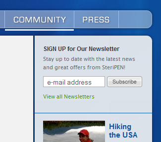
A form with a single field can provide a basic lead opportunity, and might trigger more responses. Like most of our sites with a signup widget, SteriPen‘s can be placed and ordered in any sidebar, and it provides the useful link to actually view the newletter. When the form is this short, there is no need to go to another page, or to have the callout expand to reveal the field.
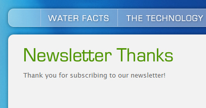
The newsletter signup should have a distinct Thank You page, providing a url for tracking as a goal in Google Analytics.
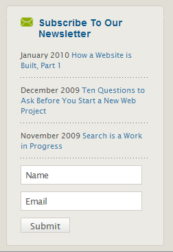
Newfangled’s sidebar signup widget asks for a name and email and includes
links to individual newsletters. I really like the combined functions: “here are our recent topics, they are published monthly, click to see one, and go ahead and sign up- it takes only two easy bits of info.”
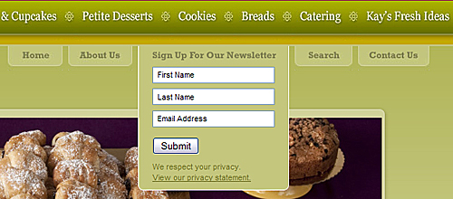
The callout that inspired this post is on a site that went live last week, Quebrada. This is also a short form, only three fields, but it is a part of the site’s everpresent global navigation–no need to place it in sidebars–and it opens on mouseover.
Hopefully these examples will suggest some possibilities and encourage
short, visible, strategically placed newsletter calls to action.