
In this month’s newsletter, I made a few passing references to how a simplified user interface can enable better concentration on written content. I’ve been thinking a lot about how reading and writing are being shaped by technology—an idea I generally categorize in my mind as “digital literacy.” I’m encouraged by trends I’m seeing toward simplifying page templates and functionality while improving the legibility and flexibility of the display. I do think we’re making some great progress, but we do have ways to go. As you’ll see in this post, doing a direct comparison between an article in its print format to how it translates to the web, and then a web page and how it translates to a tablet, we’re still stumbling along…
From Printed Page to Webpage
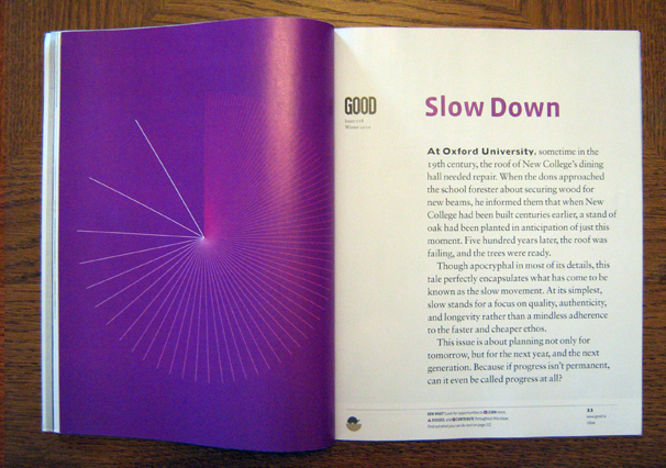
In this example, I took one picture of a very brief article I liked from the January issue of GOOD magazine, called Slow Down. In the printed version, the entire left page is occupied by a beautiful illustration of a slowly elapsing moment (which, by the way, I removed from the magazine and have framed on my office wall). On the right side is the introduction to this particular issue, on the notion of intentionally doing things more slowly. The type is large and the column narrower than the page, making it very easy to read.
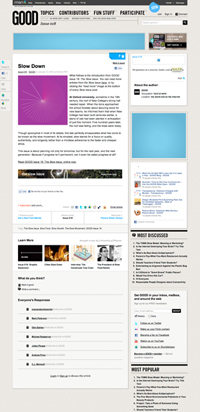
On the web version of this same article, things are very different. The first thing that’s made obvious by shrinking the article page down to only 200 pixels wide (as shown to the left) is how lost the article content is among all the other information crammed on the page. What a shame. It bothers me that they didn’t take advantage of the full width of the content column and include a larger version of the illustration. You can click the image to see it in full size.
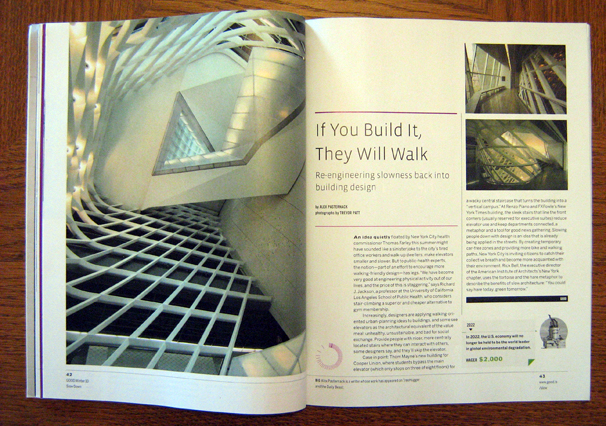
Here’s another example. Again, from the January issue of GOOD, this article, titled If You Build It, They Will Walk, occupies only two printed pages. On the left, a large photograph. On the right, a few paragraphs and some smaller photographs. The layout of the right page even evokes the architectural spaces its article discusses. Where as the “Slow Down” article’s layout made it easy for the reader to slowly read a small portion of text, this layout encourages exploration, offering multiple points of entry and a pace that evokes walking through an unpredictably structured space. Pretty clever!
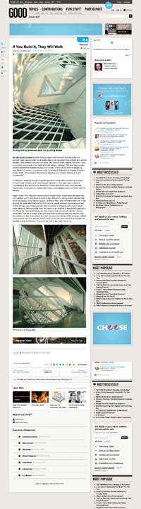
Speaking of predictable, on the left is the same article as translated for GOOD’s website. Like the first example, the article itself is lost within all the normal junk you’d find on a webpage. At least this time, the web editors used the full width of the content column to feature the photographs. But the website’s structure reduces every page to the same level of importance. A one-page print article becomes one webpage, in the same way that a three-page print article will likely become one webpage. When you flip through a magazine, considering the number of pages for various content types gives you a sense of priority and definition within the entire publication. Not so on a website.
…Sure, we have web pagination, but I can’t wait for that UI convention to go away forever.
|
|
|
|
|
|
|
V
Again, if you’d like to see this monstrosity in action, click here.
From Webpage to Tablet
The collective disappointment with how content intended for readers translated from print to web surely had something to do with the creation of the tablet—it’s just a shame that all of us Trekkies had to wait so long 😉 So far, content optimized for the iPad has been in part successful, but also in part disappointing.
Below is a pretty low-fi animated GIF representation of an article from WIRED magazine’s May issue by Nicholas Carr on how the web shatters focus and rewires brains. As soon as I’d downloaded the iPad version of this issue, I began reading this article. I really liked the way I could move instantly from one page to another with a slight movement of my thumb, as opposed to web-pagination that tends to be located at the top or bottom of pages and requires that you wait for a full page to load after clicking. It was so easy!
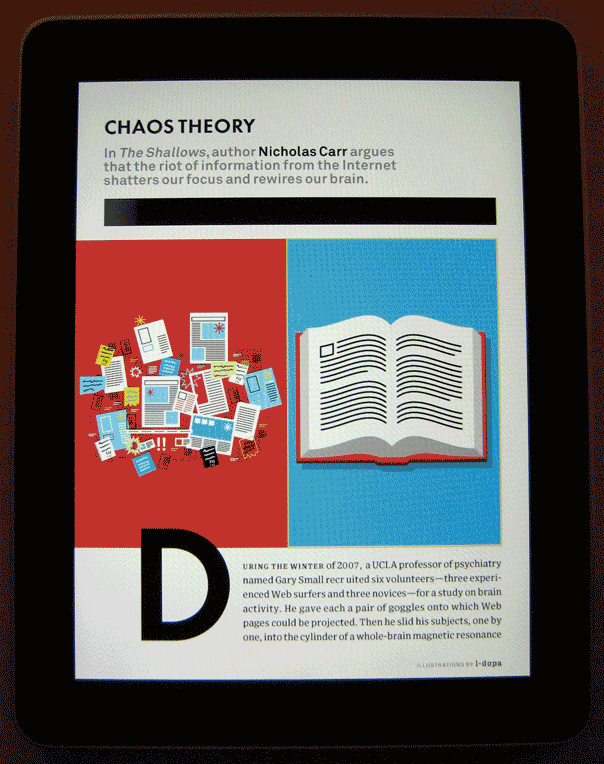
But I was also disappointed in how the iPad tended to more often preserve layout conventions of the printed page rather than taking advantage of new ones unique to the tablet’s screen. For instance, the two-column layout was actually more difficult to read than had the article been set in one column that spanned the full width of the screen. Sure, the pullquotes and illustrations give much more visual interest to the page, but when you have difficulty reading the thing, those matter much less. It was also disappointing to realize I couldn’t adjust the text size like I can using iBooks.
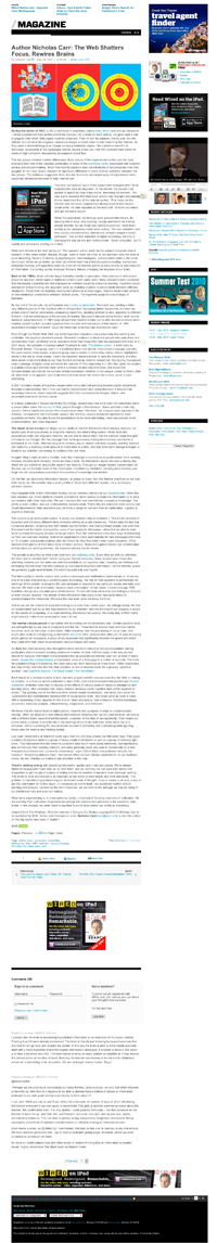
I ended up loading the web version of this same article (which, by the way, you can read at no cost on the iPad, compared with $3.99 per iPad-optimized issue) and using the pinch gesture to zoom in on only the content column. Reading this way was, sadly, much easier and more satisfying than the version that WIRED and Adobe had labored over for the iPad.
Incientally, on the topic of length, looking at the screenshot to the left brings the word “long” to mind. But what does that really mean on the screen? Is it a matter of how many “screens” an article occupies—how many times I have to scroll to continue reading? Or is it a matter of how long it takes me to read it?
|
|
|
|
|
|
|
|
|
|
|
|
|
|
|
|
|
|
|
|
|
|
|
|
V
One last thought: Clearly, the tablet realm of content is a work in progress. We’ll definitely get better at it, and in the meantime, I have iBooks to validate the expense (it’s very good). But one thing that is an immediate benefit to reading—even, perhaps, with the hard-to-read WIRED app—is the way that it enables focus. When I’m reading a book, or from an app, there is no toolbar around the content, no sidebar widgets, no tabs—no distractions.
What do you think? Are you sticking with printed magazines? Websites? Or are you fully converted to all-tablet reading?
P.S. After reviewing what I’d written, I should probably re-emphasize that I’m looking at all of these issues from the point of view of reading and the challenges posed by technology on concentration. But there are other obvious benefits of web-based content, such as being able to search for and within it, as well as being able to synthesize information from it and reorganize or share it as you like. Just wanted to cover that counterpoint.
Related Posts
-

The future of the Web is everywhere. The future of the Web is not at…
-

Chris Butler will be speaking at the concluding session of the AIGA's Web101 course...
-
A book about the whys of interactive design, not the hows...