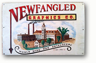
When I arrived at Newfangled almost twelve years ago, the company was known as Newfangled Graphics Co. and the hand-painted wooden sign by the door featured a 19th century Industrial Revolution-style logo.
Co-founders Steve Brock and Eric Holter began Newfangled in 1995 out of Eric’s basement in Warren, RI. The name came from Eric’s multiple pursuits of letterpress printing, wood engraving and computer-based design; his business card at the time read “newfangled and old fashioned and graphics.” Newfangled was chosen as the name for the startup web design company because Eric and Steve liked the irony of combining cutting-edge web design with turn-of-the-century mechanical technology. Steve’s inspiration for the original Newfangled logo were the metal-engraved industrial letterheads of the 1850’s, featuring detailed illustrations of factories combined with the ornate scroll work and flourished typography of the Victorian age.
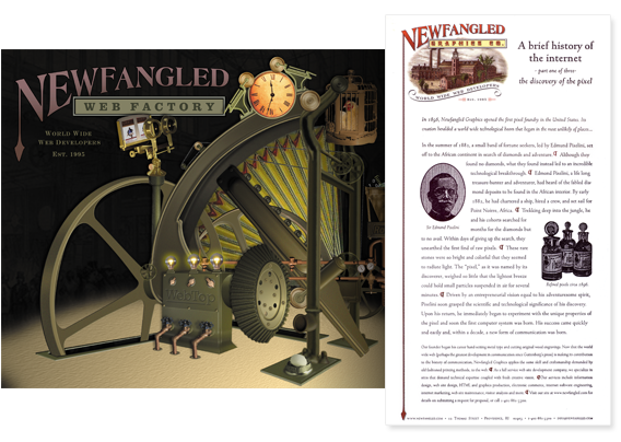 For several years, the industrial metaphor served Newfangled as a unique and clever marketing brand. Early versions of the website architecture contained mechanical design elements and the employee page featured turn-of-the-century portraits complete with appropriately anachronistic biographies. A fabricated history of Newfangled’s “founder,” Edmund Pixelini, detailed how he had discovered raw pixel minerals while fortune-hunting in the Belgian Congo. One of the most exotic elements of past Newfangled websites was “the machine”— an animated splash page that featured a Rube Goldberg-like contraption that one of our developers and I came up with. The machine contained interactive components that linked to some of Newfangled’s services such as our prototyping process and content management system but it also featured a lot of other non-development-related items such as glowing lightbulbs, a clock that ran backwards and an egg-laying chicken.
The first change to the logo came in 2000 when the identifier line “Graphics Co.” was changed to “Web Factory.” Newfangled had grown from a two man shop to a company of ten employees and was in the midst of developing proprietary website prototyping and content management systems that would expand the nature of its services beyond just web graphics.
At the time, I was designing Newfangled’s marketing materials and found the complex logo difficult to work with. The fine detail of the factory illustration and delicately etched drop shadows didn’t reproduce very well at small sizes and the two-color version of the logo created for company stationery was difficult for small commercial printers to produce because of the precise color alignment of the sepia and black.
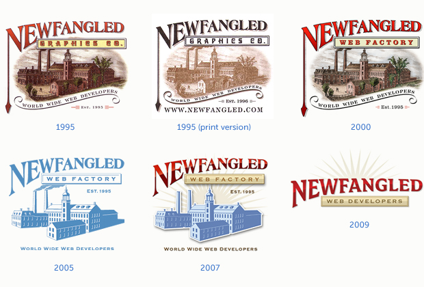
In 2005 I decided to refresh the Newfangled logo and create a more contemporary version. Simplifying the factory illustration into a silhouette and reducing some of the fussier details around the letterforms (like the “tail” of the capital N). allowed the logo to be printed in a single color and gave it more of an iconic look and feel. The new logo became more of a metaphor for web development rather than a literal representation of a factory.
While this change made printing simpler and less expensive, the 1-color logo lacked some of its predecessor’s charm. So I designed an embellished version for the website and Powerpoint presentations. I brought back some of the colors from the previous logo and the logotype and name plate were given polished metal surfaces. A subtle sunburst was added behind the factory and an overall depth provided through a drop shadow.
In 2009, the Newfangled website went through a major redesign. We decided that the company’s look and feel should move away from the industrial metaphor. The term “web factory” was replaced by “web developers,” the factory illustration that had been part of the logo from the beginning was removed and the logotype composition was tightened up. I changed the font used in the Newfangled logotype from a modified version of Engravers Roman (with a high contrast between the thick and thin strokes) to one with a more uniform stroke weight. This helped the logo read better at small sizes. I also flattened out the arched underside of the logotype to help it better marry up with the name plate, which had been shortened. To visually balance the name plate, I retained the sunburst element from the previous version of the logo.
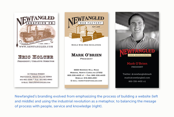
Through each change to the logo, I tried to honor its origins while adjusting it for changes in marketing direction and production requirements (the logo has been hand painted, carved in wood, cut from vinyl, printed on paper and digitized) But as the website evolved from a design-as-metaphor portfolio site to a modern marketing website knowledge base, the logo lost touch with its roots. It was beginning to look and feel a little out of place both online and in print as the personality and mission of the company changed. It wasn’t just print production issues any longer that was making the Newfangled logo a challenge to work with, it was also the fact that Newfangled the company had evolved considerably over the past 17 years and the logo, although modified, was not keeping up.
For the past five years, Chris Butler (Newfangled’s Vice President) and I have collaborated to develop the company’s brand around the regular content we produce such as newsletters, blog posts, webinars and even twitter feeds. We still care very much about visual design but our definition of design has grown to include site content and user experience issues as well.
As you read this, there is a new website in the works and we’ve carefully considered the Newfangled logo and its evolution along with our website’s new look and feel. I’m pretty excited about what we’ve come up with and we look forward to sharing it with you in the next few months.
Stay tuned…