At Newfangled we recently began using Mood Boards as a first step in our design process to establish a site’s branding, typography, imagery, color palette and other design elements. Mood Boards have been compared to an interior designer’s initial swatch panel showing the fabrics and colors that will be used to design a room; a mood board can set the aesthetic course of a site, but does not represent any actual architecture like a page design mockup does.
Once a look and feel has been established, we proceed to lay out the home page and a few key interior pages, applying the approved “mood”. The images in our mood boards are not necessarily ones that would be used on the site; they could be used, but they are meant to establish and support the visual feeling of each independent board.
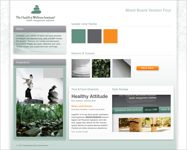
Here is a moodboard approved by the client.
And here is a final, approved design.
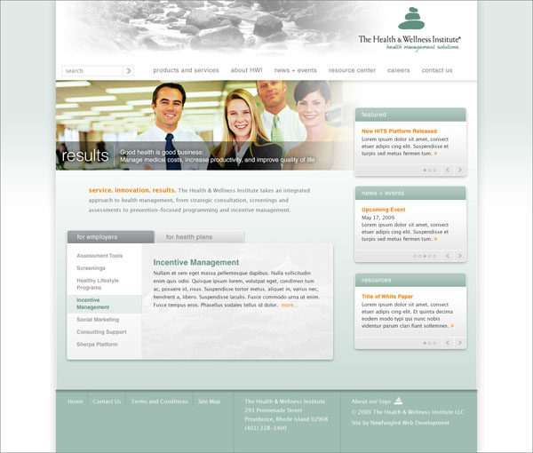
Note that the design does not include all of the elements indicated in the mood board–those elements may be spread across the site, and the board is also a jumping off point for a few rounds of design, so naturally things change. But the board established a palette and type of imagery that gave the designer a clear direction.
Another thing I need to note is that it is essential to make sure the client is completely aware of the difference between the mood boards and the actual designs yet to come. In one instance a client responded very positively to the mood board, which was presented via a template full of straight lines and square-cornered elements. After delivering some more organic-looking actual designs, we realized that the client’s team loved the mood boards in part because they felt the sharp corners and precise lines fit their brand, and our designs had to be adjusted in that direction.