A year ago, Chris Butler suggested I select one of our clients and chronicle the web development experience, diary-style, from the point of view as Newfangled’s Creative Director (the design department is a lonely place since I’m the only person in it). The following is a behind-the-scenes look at the six-month period from kick-off call to site launch of August Jackson, a marketing services firm that came to Newfangled through a word-of-mouth referral.
The Newfangled team: Katie Jamison (Senior Project Manager), Chris Creech (Assistant Project Manager), Jim Hendrickson (Developer), and myself. Chris Butler (Vice President) is also involved in most projects, checking in at various points along the way.
The August Jackson team: Jennifer Swindler (Executive Creative Director), Marshall Wolfe (Design Director), and Eileen Page (Senior Producer).
1/17/11
Received an email from Chris Butler announcing the project. Haven’t looked at the client site or contract yet because the kick-off isn’t until March.
1/18/11
A few other emails come in; Katie and Chris C. responding to the project announcement.
I check out the client site and my first impression is that we have a lot of work to do. The site is 100% Flash with lots of distracting animation and sound. The Flash is also keeping all of the site’s content from being indexed by Google and other search engines, essentially hiding it. Came across some new terms while reading the site: “consumer passionistas and user loyalists.” Definitely need to look those up.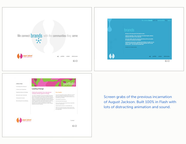
This project is a good candidate for the diary-style blog post that Chris B. had suggested; tracking the project from inception to finish.
 2/22/11
Mark, Newfangled’s president, schedules an internal pre-kickoff meeting at 2:30. I review the screen shots I took of AJ’s current site as well as the project contract to prep for the meeting. I check our admin system to see if client has been added. Not yet.
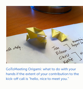
The pre-kickoff meeting becomes a client-kickoff meeting including the entire Newfangled team plus creative and marketing contacts from August Jackson (AJ). I wasn’t quite ready for the kick-off but, as it turned out, my contribution to the meeting was, “Hello, nice to meet all of you.” I think one of the challenges for this project will be to see if a team of this size can all stay on the same page.
2/23/11
Talking with Jim and Steve Brock (one of our other developers) about implementing some new features in this site, specifically a fixed position element and a flexible content area with a max/min width range. I saw some very cool applications of this on a proof of concept site.
3/1/11
Mark asked me to look at birocreative.com as a standard of site design that I could shoot for. Considered it in light of AJ and thought it would be good to idea to get info on their corporate culture. Asked Katie the best way we could do that.
Also, I think we can get away with showing potential imagery in mood board and page layout phase; AJ may be willing to hire photographer/illustrator to produce if they like what we show them.
3/2/11
Kickoff call today with about 14 people in attendance on a GoToMeeting call. Mark explained our process and Katie covered the schedule. This was the first time I had seen Mark’s 9-step “planning process” that he used to explain how we would move AJ through the development process.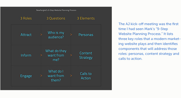
Hindsight Observation: In the meeting, I was concerned when August Jackson’s owner, Frank, nixed the blog component from the content strategy. And then we discovered that AJ might not be able to reference some of their clients by name in the portfolio section of the new site. Frank explained why a traditional blog wouldn’t fit their marketing model, plus he didn’t want it to become AJ’s version of Facebook. This made sense and, in the end, it all worked out. But at the time, it seemed like we were starting the project with one hand tied in regards to content strategy.
3/7/11
Reworked Newfangled’s Website Profile form to include Mark’s 9-step Planning Process as well as some elements from two other marketing agency’s client worksheets. I included a section on corporate culture (keeping AJ in mind) and shared the document with Katie so it could be finessed.
3/9/11
Katie sent me AJ’s responses to our website planning form as well as their new logo. I reviewed the doc and sent Katie back several questions and comments. Found another mash-up word in the client’s written feedback: “permalancer.” The HRdictionary.com defines it as a freelancer who’s worked for one company for a long period of time. Learning new stuff every day.
I told Katie that I had concerns about the new logo and the size of the identifier lines. They’re going to be really difficult to read, especially if the logo is reduced. I know AJ didn’t ask for my feedback but I’d feel like I was committing a sin of omission if I didn’t mention this design/production issue. Hopefully, they’ve designed alternate versions for small size use.![]()
![]()
Katie is hosting a call with AJ today to review some of the feedback. I can’t be part of today’s call due to a schedule conflict but I’ll be joining one on Friday to discuss design.
AJ sent some photos of their new office in D.C. I’m assuming these are preliminary pics just to give us something to discuss on Friday. AJ stated in the website planning form, “We like our site to be clean and simple in color and approach and use imagery in a powerful way.” I’m going to push for professional photography so I have some good raw material to work with.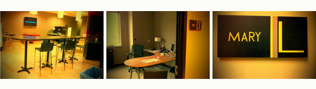
3/10/11
Reading over the entries from the past few days and I sound somewhat pessimistic. I’m too young to be a grumpy old man. Honestly, I really am looking forward to designing this site.
3/11/11
Reviewed submitted sites from client and made list of questions for planning meeting at 10:30. Feel like I’m starting to get my head around this project. It always takes me a while to wade into the client’s world.
Marshall from the Chicago office sent some stills from a walk-through video of their office. Better quality images than the D.C. ones but still not a quality I can use for design. He promised he would take better stills soon.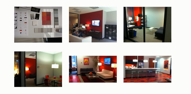
Feeling much better about this project since the call. AJ is going to send client material (one client per market area) so I can use the material for designing case studies. The blog seems to be back in the mix. Talked about how to present some of the AJ culture through blog posts.
3/14/11
Chris B. and I talked last Friday about how to avoid moving too fast from mood boards to page layouts which tends to make the client believe the mood boards are page layouts instead of ideas for the “big picture” of look and feel. Chris recommends incremental progress from mood boards to page layouts. I’m looking forward to getting AJ’s client material so I can dive into the mood boards.
3/16/11
Huge client work dump from AJ today; all of it from their public sector clients. Good stuff. Can’t understand why their current site doesn’t showcase any of it. Also looked back at their website profile document and reviewed their “fave” sites. The comments for all of them boil down to one thing: big, beautiful images. I’ll probably start with that and their new logo branding. I like being able to start with a client-supplied color palette; if for no other reason than the client can’t say they don’t like the colors I’ve used.
Prototype phase has begun. Had a review with the client today. The only thing that exists so far is the navigation but structuring this site properly will be critical. Lots of discussion about how to represent the work in the three practice areas (health care, brand engagement and public). It’s becoming clear that their work content will be the central focus of the site; everything will hang off it. AJ has assured me they will have enough health care client material that can be shown and want three case studies per practice area.
3/18/11
“The Wall” (what we’ve begun calling AJ’s cultural bulletin board idea) is no longer a separate component from the blog. It’s become the blog.
Prototype review today with Katie, Jim, Chris C. and Chris B. After a meeting with AJ, the navigation has been streamlined down to five elements. Katie and I discussed how to best represent the home page; we’re trying to break away from the “slide show and three sisters” arrangement that has dominated several of our recent sites. I suggested we simply represent the practice areas with three large boxes so the design can remain open-ended. Katie will send me some sketches that show how she envisions the home page. I’m thinking a carousel-style feature with over-sized images similar to the Rolex.com site.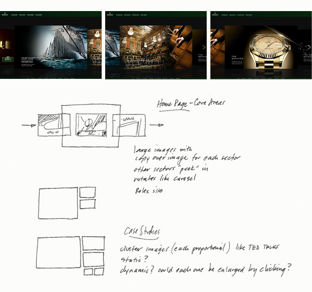
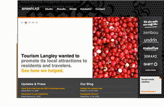
For the case study pages, Katie referenced a page from SmashLab.com with an image and text arrangement that may work for our purposes.
Hindsight Observation: What I saw when Katie sent me this screen grab was a large image juxtaposed with a short abstract set in large text. Even though the final case study pages didn’t end up looking anything like Smashlab’s, it provided a good starting point.
3/22/11
Started mood boards today. Discovered an easy way to take time-lapse images of my screen using a Terminal script so I can track some of my design progress. Have to turn on the script and forget about it though; I’m extremely conscious of the fact I’m being “watched.”
Hindsight Observation: As I watch this now it confirms my belief that design is as much about the process as it is about finished pieces. Although many of the design elements shown in this video made it to the final site design, none of the page layouts made the final cut.
music: Piano Concerto No. 20 in D minor by Wolfgang Amadeus Mozart
3/28/11
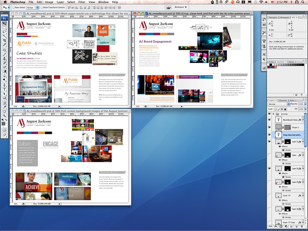
Just finished the fourth day of working on the mood boards. Probably the most intense design process so far. Thankful that the AJ site offers some design latitude and I can try some new things that I might not be able to do otherwise. I’m going to present three boards with “previews” that are some of the most finished I’ve ever produced. I start with sketches and whatever inspirational clippings I’ve collected and then create a layout inside a blank PSD to see if my ideas will really work on the page. I’ll push elements around for a while, maybe creating additional copies of the layout to try out new ideas. After I’m happy with a layout, I’ll assemble a mood board. It may seem like working backwards but it just makes more sense to go from the sandbox of a loose layout to the more finished mood board.
Last Friday during my design review with Chris B., we discussed the challenge of working with AJ’s new logos. Because I can’t help myself, I had to to come up with some alternatives that read better at small sizes and were more streamlined. I think one of AJ’s “permalancers” was contracted to develop the logo so I hope I’m not stepping on anyone’s toes.
I kept the color palette but ditched the stylized monogram. It seemed unnecessary since it didn’t really add any new info to the logo; it was actually very distracting, especially considering it was the largest element in the logo. Actually, I came up with three versions of the logo set. I sent them to Chris for feedback. I know they’ll never see the light of day but I feel better for having worked through the process.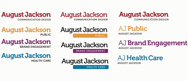
3/30/11
I have the first round of mood boards posted and will have a review call with AJ today at 3:30. I think the internal reviews with Chris and Katie have helped make these mood boards some of the best thought-out boards I’ve done to date. I definitely feel like I’m starting to understand and refine the process of putting these together (and only two years after my first mood boards!). These are the first mood boards in which we’ve pushed a particular technology in addition to design. I’m confident that what we are presenting today is quality stuff but you never know how a client is going to react.
The theme of today’s review with AJ will be “Who Are You?” In other words, how do you want to present yourself to prospective clients and how do you want them to perceive you? I suggested we use The Who’s seminal song “Who Are You?” as today’s theme music for the meeting. That would probably work great until Roger Daltrey’s F-bomb-enhanced refrains begin.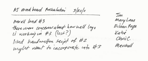
4/5/11
Had a follow-up call today with AJ to review the final feedback of the first round mood boards.
We’re moving on to a second round to see if we can incorporate some of the elements from MB #2 and MB #3. AJ liked the casual feel of the handwritten fonts in MB #2 and the aggressiveness of MB #3.
Marshall, AJ’s design director, has been very helpful and cooperative. I thought he might be offended when I suggested they rework the AJ logo, but they took my recommendation and have been tweaking it. Marshall sent me version no. 7 of their progress and the identifier lines are more readible.
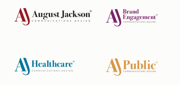 He and I agreed that logo design is 35% design and 65% politics. I have a real love/hate relationship with logo design. Love the design challenge and the problem-solving process, hate the politics.
We’re also going to be using images other than the beauty shots of their new Chicago offices. I guess someone at AJ thinks it might make them look like they’re spending too much money on interior design; ergo, charging their clients too much.
Hindsight Observation: Rather than feature AJ’s studio interiors as square-ups, we ended up using them as out-of-focus background graphics. This way they could play a prominent role in creating an atmosphere for the site without being “featured.”
4/13/11
Started the second round of mood boards today. I intended to start them on Monday, but several other small projects with high priority got in the way. I got a running start after lunch but hit the creative wall by 4:00. Hopefully I can sew it up tomorrow. I made some more time-lapse videos of the design process.
These AJ logos are proving to be a challenge to work with. They need an ample amount of white space around them to not be swallowed up by the surrounding design. Marshall sent some new Chicago office photos for me to review. Some tight shots of different elements in their office and some “action” shots of people in the office. Nice stuff; should be able to work with them.
Prototype note: “The Wall” is now “Our Space.” Your Space. My Space. Our Space?
4/14/11
Finished the fourth mood board this morning and submitted it to Chris B. and Katie for review before tomorrow’s posting. I had to work out a partial mock-up of the home page and a section page (Public) so I could see if the chosen elements from MB #2 and #3 were going to work together. I think it’s pretty tight. Now that the prototype has been approved, I just want to move on to page layouts.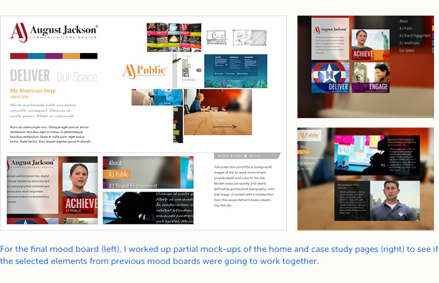
On an related note, I stumbled across a marketing agency in Australia named August. August and August Jackson: separated at birth? The design of the site also happens to be eerily similar to the mock ups I’ve been creating. I guess Solomon was right, there is nothing new under the sun.
4/26/11
Presented the first round of page layouts to the client last week. After walking them through the layouts, I asked them what they thought. There was a long pause and I thought, “well, either we got disconnected or they hate the layouts.” Finally, after what seemed like an eternity, one of the AJ team said, “We love them!” Big sigh of relief. Although there was no indication that they were unhappy with the direction we were taking them with the mood boards, you never know how the client is going to react when you show them real page layouts.
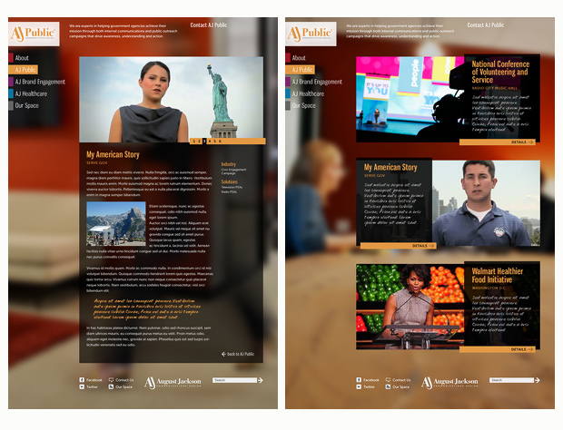
There is one challenge, though. The AJ team to wanted to know if we could incorporate the main AJ logo somewhere in the top of the page (they were anticipating that the owner would request it). We were reviewing practice area layouts so there was already an AJ Public logo prominently at the top. The last thing I want is two AJ logos duking it out at the top of the site. I need to figure out some way to make this work so we don’t end up back at square one when these layouts are presented to the owner.
4/27/11
Internal review surfaced some issues with the functionality of the site. Chris B. brought up, and rightly so, that the usability of the site was suffering because the practice area logos were taking the place of the main AJ identity and didn’t give a visitor to the site a clear choice for navigating to the home page (or providing them a clear picture of which site they were on). Chris was also concerned that a left-locked site would leave a huge open space to the right when someone put their browser in giant-screen mode. So after several phone and Skype conversations, Katie and I decided the content area should be centered and float with browser expansion/contraction. The logo and nav will remain locked left.
In our client review call we offered three choices for addressing the main logo/practice area logo issue. We presented it mainly as a usability issue with the aesthetics a distant second. In the back and forth of the call we came up with a solution to use the main AJ logo as the site badge, increase the mission statement and logo on the practice landing pages and then use a more diminutive version on the practice detail pages. We’ll be posting a new round of layouts next week.
All in all, this project is going very well. Oh, and the owner has seen the layouts. No feedback yet, though.
5/4/11
Posted new practice area pages for Katie and Chris B. to review. Each practice area now has its own mini header that incorporates the practice logo and mission statement. Also moved forward and laid out an About page. It felt good to get away from the practice pages for a while. It helped me to work out some of the other template issues like what to do with the sub nav of the About section. I ended up borrowing the slide show navigation element from the practice detail page.
I still feel really good about how this site is shaping up. I hope AJ is thoughtful with their content entry; it’d be nice to use this site as showcase.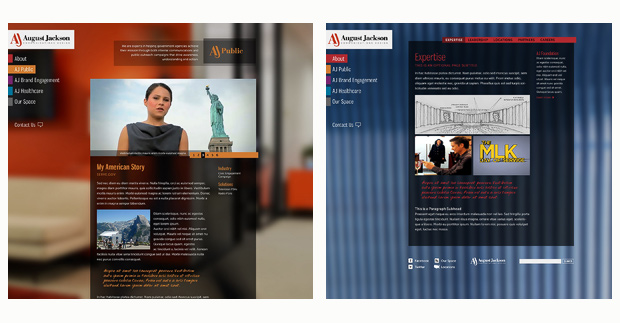
5/25/11
A lot has happened in the past few weeks. We received approval on the sub pages after some back and forth on the the mission statement and practice section logos. One comment I received from one of the AJ team after making a very small tweak to the main logo was, “I cried tears of joy.” These people need to get out of the office more often.
I’ve posted home page layouts for a review with AJ this morning. The first layout was based on some things I had done in the mood board phase and was heavily influenced by another site, gmmb.com. When Katie saw it she was concerned it was too close to gmmb and, since they are direct competitors with AJ, might cause some problems in review. My fur got a bit ruffled because I wanted to get this last approval quickly (other work was piling up) and I made the common designer mistake of falling in love with an earlier layout and didn’t think the home page needed further exploration.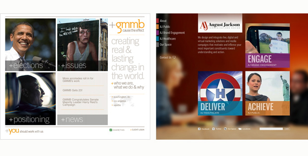
Chris B. convinced me to take another look at it and emailed me a quick sketch to get things started. In about three hours I came up with a second layout that is probably stronger than the first; it also included some content mouse over states for the practice area abstracts that I hadn’t considered before.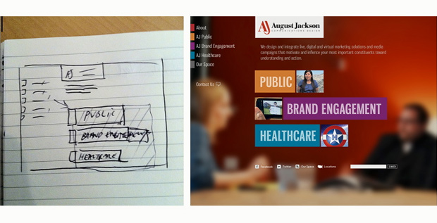
I’m very happy we’ve had a good relationship with AJ through this entire process. Our main contacts at AJ seem to have autonomy in regards to making final design decisions and, best of all, they seem to respect our expertise when it comes to recommending design direction.
5/25/11
5:09 PM – Well, clients still remain unpredictable. They didn’t really like either home page layout. Mission statement needs to be much more prominent and they think the three practice area squares are too limited; they took us back to the mood board and the inspiration collage at the top of the board. This is the second client who has pointed to the collage and requested it be a part of their design. Maybe I need to adjust the mood board template design.
So it’s back to the drawing board for the AJ home page. I’m thinking of trying to incorporate imagery somehow in a giant mission statement or possibly using multiple images/sizes (like Ted talks) for each practice area. Right now, I just need a few days away from it.
Hindsight Observation: During the call, while both teams were wrestling with what to do about the home page, Marshall made an off-hand comment, “If it were completely up to me, I’d have nothing but our logo and a giant mission statement on the home page!” I made a note but didn’t give it any further thought. I was starting to burn out a bit. What I didn’t realize at that time was that Marshall had planted a seed in my head that would send the home page in a completely different direction and shake me out of my love affair with the original home page concept.
The beauty of our interaction was that Marshall told me what the focus of the home page was supposed to be and didn’t try to art direct a specific solution.
6/15/11
Jim has started skinning the white screen and I’ve just posted the third round of home page layouts. In the second round, we showed AJ a couple of versions with small images integrated into a giant mission statement.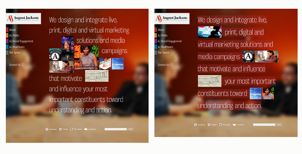
They preferred the version in which the images were scattered throughout the statement. We posted one more version with images of varied sizes and they loved it. The actual statement from the conference call was, “it warms my heart.” So, we were good to go and I prepped the home page layout to be skinned. A week later, we received an email saying the mission statement had been “tweaked a bit.” Actually, it was shortened by about a third. Given the precise balance of text and image in the layout, it wasn’t going to be a quick fix. However, after about 45 minutes, I was able to come up with a layout that worked (and it also brought the entire collage up the page about 50 pixels).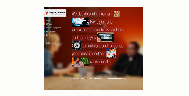
So, all in all, not as big a problem as I thought it might be. Now we wait for feedback.
6/22/11
Got approval on the home page. Site skinning is coming along nicely. Just gave Jim the last of the Photoshop files. Can’t remember the last time I laid out every single page in a website. I went into the CSS files yesterday to change a font that had been specced incorrectly. I told Jim what I did and he asked sarcastically, “so, when are you going to finish skinning the site?”
Now that design creation is finished, I wait until it’s time to QA (quality assurance) the skinned site.
6/29/11
I did the first round of design QA this morning. Not that much to correct. I’ll do another round once the client starts uploading their actual content.
Jim pointed out yesterday that the contact form on the Locations page was fairly low and he thought in some browser/monitor circumstances the submit button might be cut off. In my head I heard, “Arrgh! I thought we were done with the design phase!” So I suggested we leave it be.
After sulking about it for a while (plus Jim’s suggestion that we talk with Katie about it), I came up with a few alternatives for dealing with the position of the form. I created two layouts: one with the form collapsed and placed on the right side of the page and one with the form integrated into the top of Locations page. I wasn’t thrilled with either one of these but I couldn’t come up with anything else. Just before lunch, Katie sent me and Jim a link to another recent Newfangled site. Their contact form was a universal link in the right side bar that, when clicked, opened a pop-up form in the top middle of the page. Simple and brilliant. So the time I spent coming up with two mediocre ideas (plus my internal hissy fit) suddenly looked really stupid. Score one for the developer and the project manager.
7/19/11
The site is two days away from going live. I received an email from Katie yesterday that said, “They love the site but…” Someone at August Jackson looked at the site on their netbook and could only see one case study on the practice pages. They seemed convinced no one will scroll down to see the rest of the content.
I took a look at the site on my wife’s 13″ MacBook and confirmed the client’s assertion. Ultimately, I don’t think this is going to be an issue because scrolling is a common practice and users assume there is more content than what can be seen.
But I came up with a couple of possible solutions:
1) Reduce the landing page mission statement and move the case studies up the page so that a portion of the second case study shows above 650 pixels. This is about where a 13″ screen would end, depending on the resolution. Downside: smaller mission statement and the logo box, mission statement and left side navigation create a “visual frame” around the page content— which I was trying to avoid.
2) Have the case studies slide in from the top on page load using javascript. This would “alert” the viewer that there is more content beneath the bottom of their screen. Downside: We would be complicating the back end of the site a lot and I have no idea how much development time this would take.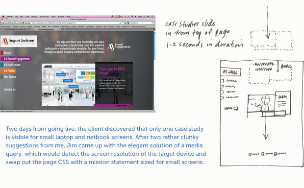
In our site review meeting, Jim came up with the best solution (other than leaving it alone). Program into the site a media query which would detect the screen resolution of the viewing device and swap out the CSS for the mission statement with a smaller font and line height. This would push the content up the page for small laptops and tablets.
Katie is going to create a quote for the media query work and submit it to AJ as a post-live, phase two maintenance item. AJ already announced that their new site was going to be live on Thursday so it didn’t leave us any time to do the work pre-go live.
7/21/11
August Jackson went live this morning. The client placed a 1 minute introductory video in front of the site which will run for two weeks and will only play when a visitor comes to the site for the first time. Although a bit of a UX no-no, since it’s temporary I suppose it’s not that big of deal.
The really big deal is that this was one of the smoothest production experiences I’ve had in a while and the client is very happy with the site. Hoo-rah.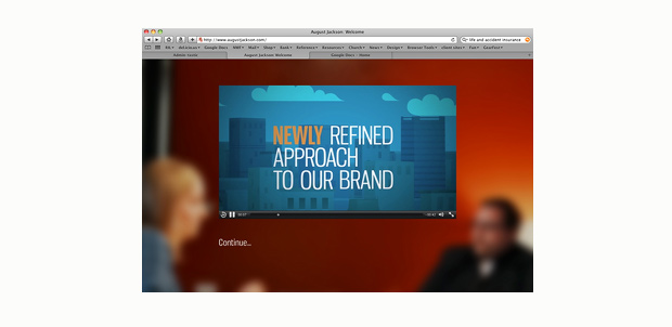
7/22/11
Received two emails from the AJ team. Both very glowing.
From the first email: “Thank you so much for our beautiful new site. We are getting rave reviews from colleagues… You were an amazing team to work with—so talented, true professionals… You have elevated our site and our branding to an entirely new level and we are very grateful. Mark, you have some true rock stars on your team!”
Of course, I had to respond. Rock Stars? Really? Sweet!
I was a big fan of Ace Frehley when I was a kid, but Katie’s head fit so much better.
From the second email: “I want to second everything (my collegue) said, plus let you know that every time I hung up after a call with the team I’d say to myself (or anyone nearby who’d listen), “I LOVE NEWFANGLED!!!”
THANK YOU, THANK YOU, THANK YOU for a doing an amazing job on our site, and for being so wonderful to work with!”
Epilogue
This really was a great project to work on for many reasons: great client, quality source material, and very few creative restrictions. As a result of tracking this project from start to finish and then compiling it for this post, I’ve learned the following:
1) A good relationship with the client based on mutual respect and trust is essential to a sucessful project.
2) The collaborative problem-solving process is as important as the finished product itself.
3) Designers, regardless of their skill level, thrive best when working as part of a team and are challenged to go the extra step.
4) Properly designed and developed websites require a lot of time and hard work.